Click to view our Accessibility Statement or contact us with accessibility-related questions


Showing 1 of 386 conversations about:

ProfessorPat
380
Aug 8, 2017
bookmark_border
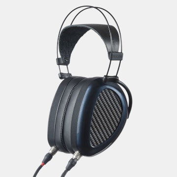
Further confirmation that Massdrop is all about pushing this ugly blue in their X editions. It's not even the blue they use for their branding. Can't we at least use that color palette if we have to have a brand identifying color scheme? I'd much rather see white with their light blue for accents than this goofy matte dark blue on everything.

bharker
78
Aug 8, 2017
bookmark_border
ProfessorPatI dig the colour scheme. Also the HE4XX looks really nice as well. Personal preference I guess, maybe buy the original Porta Pros if you don't like these?
Fukuro
98
Aug 8, 2017
bookmark_border
ProfessorPatThis dark blue is significantly better than the grey Sennheiser uses.

ProfessorPat
380
Aug 8, 2017
bookmark_border
FukuroAgreed, but again, it's for branding, but MD doesn't produce the headphones... they don't push for this blue on anything beyond the headphones either. Why the insistence that people are able to recognize your collaboration with the manufacturer? Especially given that the IEMs are too small for most to recognize at a glance, and the HE-4XX, being an open headphone, is unlikely to see much time out in the wild.
Admittedly, I'm not a big fan of dark blue, but I can get past that. My bigger issue is that they seem to have an unhealthy fear of anything being remotely glossy. In the PortaPro, there is enough chromed steel hanging out there to offset it a bit, but the Mee, Nuforce, and Hifiman drops have all been incredibly dull. The only way to get gloss is to be on wood it seems (where I feel you could get away with a soft oil rubbed look a lot easier given the grain's interest).
I get not going full gloss on every little part. That, like a car with too much chrome, looks like a cheap pile of garbage. But full flat finishes looks equally cheap, albeit more in the unfinished vein rather than outright cheap.
Have you seen most used Denon D2000? That flat black shell gets spot glossed by any little bumps to the point where it looks terrible. I never saw a complaint about the portapro being too shiny. I've seen plenty of people call them flat out ugly; but nobody complained that they were too shiny.
Fukuro
98
Aug 8, 2017
bookmark_border
ProfessorPatoh ya definitely not a looker here. but dark blue works for me, for Im a sucker for matte products especially if its black. So to me colour is fine, just the design. Also while we are at it. generally not a fan of hifiman's design, but with the he4xx looks like im gonna reconsider. And its the same story with these koss...no a fan.
insightsurf88
72
Aug 8, 2017
bookmark_border
ProfessorPatSee it as the beige from noctua's fan legacy coolers. Theyre kind of Institutionalizing this blue. I personally don't care as for headphones color: I'm no fashion victim in terms of my headphones choices


