Click to view our Accessibility Statement or contact us with accessibility-related questions


Showing 1 of 1481 conversations about:

MiTo
13955
MiTo
May 11, 2017
bookmark_border

MiTo
13955
MiTo
May 12, 2017
bookmark_border
CallmeminerThose are doing good as well, standard legends so not exactly something new or that requires adjustments, etc.
Raccatography
197
May 12, 2017
bookmark_border
MiToI peed myself. I'm so happy!! Thanks for the update, Mito
JA_MAN
70
May 22, 2017
bookmark_border
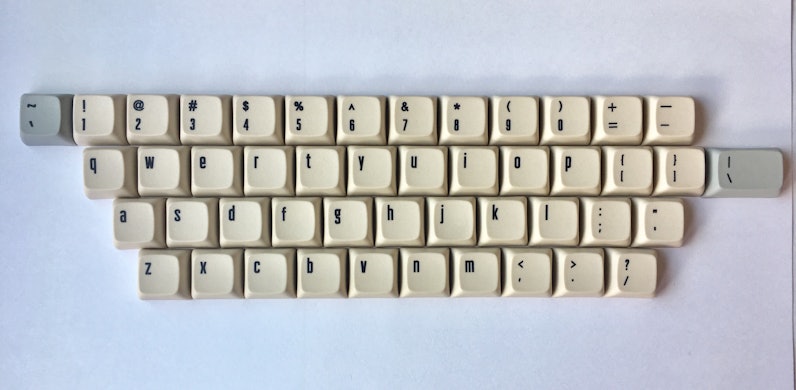
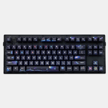
MiToAw, what a shame. The font looks like it has a heavier weight to it than in the render images. Almost like someone put bold on them. I loved that clean, crisp, and thin look to the font in the presented images when purchasing. These don't look too hot, to be honest. The fonts almost looks fuzzy. Really disappointing. :(
And the equals sign looks slanted.
And the equals sign looks slanted.
MiTo
13955
MiTo
May 22, 2017
bookmark_border
JA_MANSadly, computer generated renders can only do so much and represent somewhat accurately the finished product. The equal sign is not slanted, that's guaranteed and there's no fuzz in the keycaps at all.
flyinglotus1983
358
May 23, 2017
bookmark_border
JA_MAN@JA_MAN agreed, the font is waaaay too thick. Extremely disappointing, I really wanted it to look like the rendering (is that too much to ask?). I know that Signature Plastics gets a lot of shit, but you know what, their dye sublimination is CLEARLY better than what this Chinese manufacturer can safely pull off.

JA_MAN
70
May 23, 2017
bookmark_border
flyinglotus1983 Yeah, it's definitely possible. I've seen very thin dye sub fonts on keycaps before. Varmilo does a really nice clean and crisp dye sub with a very thin font face. It almost looks lasered on, that's how good it is. Same with Leopold keyboards, very clean looking dye sub. And as you mentioned, SP has a clean dye sub as well. I don't buy into the "renders can do so much".
It just looks like not a very good person was selected to do the dye sub , probably to cut costs and increase profits. Or maybe it was just an oversight. Who knows? This dye sub reminds me of those caller id's from the 90's for blind people with the huge weighty font.
I wouldn't be so pissed if the price wasn't so ridiculous. $70 shipped for a 60% board is absurd, especially when you expect one thing and get something else. Sorry Mito, but you dropped the ball on the dye sub.
MiTo
13955
MiTo
May 23, 2017
bookmark_border
JA_MANThe manufacturer can definitely dyesub thin lines, as visible on the pre-production pictures I received from the Dieter Rams kit and slashes on the Alphas as well.
The legends have the thickness you see for a reason, it's a geometric proportion I conceived to create balance between keycap surface area, ink bleed and readability, and it was like that since day one. There wasn't any "cost saving to increase profits techniques" or any other flaw. Renders arent 100% accurate and will never be.
Your opinion is more than welcome, so feel free to criticize. Hopefully I can make something you enjoy one day. Also, if you don't like the keycaps once you receive them you can contact support and return the keycaps.
MiTo
13955
MiTo
May 23, 2017
bookmark_border
JA_MANForgot to mention, another alternative would be selling on /r/mechmarket or Geekhack classifieds, but maybe you'll enjoy the caps more once you see them. In any case, I appreciate your support. I've been improving my methods to present the products a little better.
RichardV
201
May 24, 2017
bookmark_border
flyinglotus1983Aye, I'm of the same view that the fonts are too thick. Loved the renders' thinner fonts, which made the overall set look appealing and clearly, the samples have knocked down my expectations on this set. SAD!
jonjonguitar9
25
May 24, 2017
bookmark_border
RichardVAgreed. i'm glad that the $ and % characters are going to be adjusted, but the thickness makes w y v and k look off. I fell in love with the render and this just doesn't meet it.
flyinglotus1983
358
May 24, 2017
bookmark_border
MiTo> The legends have the thickness you see for a reason, it's a geometric proportion I conceived to create balance between keycap surface area, ink bleed and readability, and it was like that since day one.
I don't buy it. The only logical answer is that the manufacturer's process printed them too thick. What you're insinuating is that you designed them from the beginning to be printed that thick, but yet, somehow, the renders came out to thin. Yea, not buying it.
> Renders arent 100% accurate and will never be.
You're missing the point dude. The point is that the renders show what you WANTED it to look like. That's what WE wanted it to look like. And now your manufacturer is giving you something else. That's not an insignificant thing.
> Your opinion is more than welcome, so feel free to criticize.
I think you're already starting to see a consensus here if you look at the comments and endorsements. Nobody wants a thick bolded font. it looks like crap, it's not what we paid for. If there's still time to fix this, then please do.
> Hopefully I can make something you enjoy one day.
As far as your previous group buys go, PuLSE was great, but let's not forget all the drama and backpedaling that went on there.
> Also, if you don't like the keycaps once you receive them you can contact support and return the keycaps.
If the font is as thick as the provided pictures, then yes, I am going to return these for a full refund. What you're showing now is not what was advertised.
JA_MAN
70
May 25, 2017
bookmark_border
MiToCriticizing at this point is useless. I'm sharing my frustrations, not criticism. Nothing at this point can be changed. At least that's my understanding from the e-mails I've received that state these are already in production.
I just don't get how you throw up these renders knowing all along the font is going to be substantially heavier than what is shown. Why not at the very least mention it in the drop description that the fonts will be heavier? It just doesn't add up to me.
I just don't get how you throw up these renders knowing all along the font is going to be substantially heavier than what is shown. Why not at the very least mention it in the drop description that the fonts will be heavier? It just doesn't add up to me.
MiTo
13955
MiTo
May 25, 2017
bookmark_border
JA_MAN@JA_MAN @flyinglotus1983 - I posted an update, I also think you guys may have received an email. Make sure to check it out and thank you very much for all the support.
Pavarotti
49
May 26, 2017
bookmark_border
MiToIf you think that recent feedback has been supportive of you, then you've really not been paying very close attention.
tehmooo
60
May 26, 2017
bookmark_border
PavarottiNot gonna lie, while I am excited about the set I - am - pretty disappointed it's not going to look as slick as the renders as like many others, that's what sold it me. This is my first MD caps purchase, so quite gutted it's not gonna be what I thought it was
RichardV
201
May 27, 2017
bookmark_border
tehmoooSorry to hear that. I have bought quite a few cap sets from MD and am happy to say, this case is an exceptional one. So, don't lose heart for other drops.
Vigrith
4081
May 28, 2017
bookmark_border
PavarottiSo just because no one else is saying anything and 5 or 6 (plus 6-7~ others endorsing the comments) out of the like 2000+ people (not kits) that purchased the set are the vocal minority displeased with how the legends and dye-sub turned out that means all the recent feedback has been negative?
Wake up. I do agree the lines are far thicker and that may look bad to some; I have talked to my personal group of friends who purchased the set and they all like the samples Mito received. Granted there's only like 5 or 6 of us but considering that's how many you guys are then maybe that's not so bad you know? /s
Wake up. I do agree the lines are far thicker and that may look bad to some; I have talked to my personal group of friends who purchased the set and they all like the samples Mito received. Granted there's only like 5 or 6 of us but considering that's how many you guys are then maybe that's not so bad you know? /s
amongoose
12
May 30, 2017
bookmark_border
MiToSpeaking for myself obviously but i don't see the problem with the slightly thicker font, they still retain the same design idea from the renders so i don't think it was misleading in a way i would want to be refunded. I actually prefer the thicker font to the slim one on the renders. But of course it's only fair to want the final product to be as close to the renders as possible.
What I'm saying is that I ordered some "bauhaus inspired" key caps and those look pretty "bauhaus inspired" to me.
What I'm saying is that I ordered some "bauhaus inspired" key caps and those look pretty "bauhaus inspired" to me.
RichardV
201
May 30, 2017
bookmark_border
amongooseI too speak for myself and between the renders and the sample, it just does not cut it for me. The render's "thinner" fonts look so refined. Just compare the "g" between them. Look too at the "8".
Pavarotti
49
May 30, 2017
bookmark_border
RichardVThanks for posting these photos side-by-side . Looking at how the "0" (zero) came out, it's really hard to imagine how the missing textual key captions ("shift", for example) could possibly be rendered using this thicker font, and come out even remotely legible. It's looking more to me as if this design simply exceeds the chosen manufacturer's ability to execute. I know that MiTo and Massdrop divide responsibilities, so who actually chose the manufacturer?
RichardV
201
May 31, 2017
bookmark_border
PavarottiIn another post, Mito did mention he was waiting for samples of the mods to arrive so he could check out the outcome of the current "bolder" fonts. Here's the render of how the mods looked like at inception, legible and looked good.
Azraelian
385
May 31, 2017
bookmark_border
VigrithThere is a Chinese seller on Taobao that takes orders from Chinese customers who want to buy all these Massdrop Keycap sets (since Massdrop is all English) and he orders in bulk on Massdrop based on the number of orders he receives in China, often times hundreds of sets in one drop. But these "hundreds of people" are never seen on Massdrop.
Vigrith
4081
May 31, 2017
bookmark_border
AzraelianI am aware of that. I fail to see how that is relevant to what I wrote. Maybe they're happy, maybe they're not. You don't know, I don't know. The argument is moot.
Azraelian
385
May 31, 2017
bookmark_border
VigrithIf those hundreds of people get these updates and photos of the fonts, they might not be happy either. a bigger unhappy crowd could change things, sometimes. But then again, they dont actually have a voice in this lol (not until they receive their orders at least)

Related Products
Drop Refurbished
Like-new products you can trustDrop Rewards
Get $5 for every 500 points you earn! Learn more
Drop Keyboard Club
Become a member and expand your keycap collectionCollaborate With Us
For Brands & DesignersFollow Drop
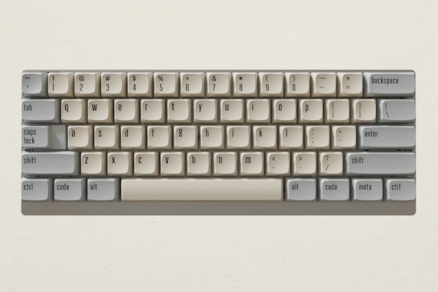
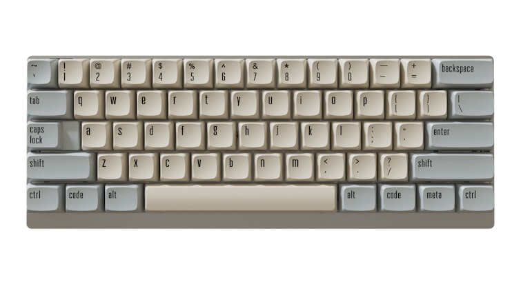
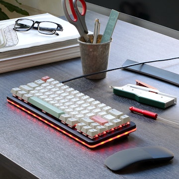
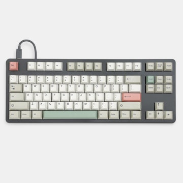
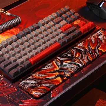
If you want a parameter, the portrait photo (first picture) displays the colors a little more accurately than the other ones. I have the keycaps on my hands and I can tell that the beige is in reality less creamy and the grey is cooler than what me and the camera managed to capture.
> The $ character; > The % character; > F1 – F12 vertical alignment on the keycaps.
Production seems to be on track and I hope to be able to share more pictures soon. Please keep an eye to the official drop discussion tab and your e-mail inboxes for updates. I’ll keep updating you guys as soon as I have more information, hope you’re excited! You can see pictures at a higher resolution in the link below:
http://mitormk.com