Click to view our Accessibility Statement or contact us with accessibility-related questions


Showing 1 of 1482 conversations about:

MiTo
13955
MiTo
Jul 8, 2017
bookmark_border


Atenacius
8
Jul 8, 2017
bookmark_border
MiToThese look fantastic! The delay is a bummer but I rather have it done right (the test batch was awful!).

Vigrith
4081
Jul 8, 2017
bookmark_border
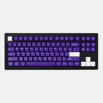
MiToDieter Rams looks fucking amazing as expected - glad I bought two of those and skipped out on regular alphas/betas, it just looks so good with the icon mods.
Bauhaus colours are also fantastic, by the way.
Força irmão! Obrigado pela dedicação.
Bauhaus colours are also fantastic, by the way.
Força irmão! Obrigado pela dedicação.


A community member
Jul 8, 2017
bookmark_border
A community member
Jul 8, 2017
bookmark_border
MiToWell, overall the Betas are bit tad bigger then rendered ones:
https://massdrop-s3.imgix.net/product-images/massdrop-x-mito-canvas-xda-custom-keycap-set/MD-33791_20170119004118_11f69d02abb2321a.jpg
But I guess they've just used the same Milestone font.
Bauhaus seems to be exactly as rendered.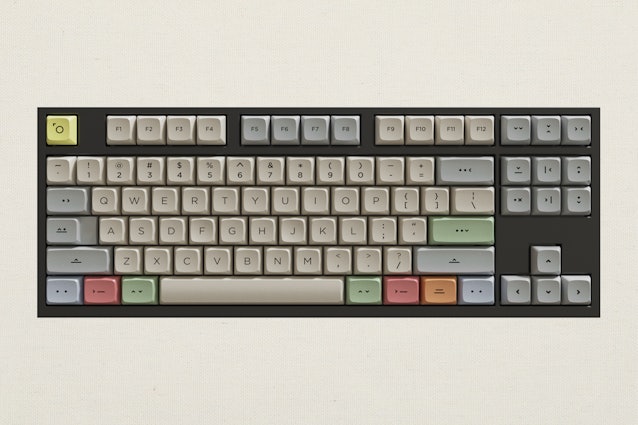
Bauhaus seems to be exactly as rendered.
MiTo
13955
MiTo
Jul 8, 2017
bookmark_border
The Betas typeface present on the renders and mockups are merely to illustrate the kit. The only way to inform people what the typeface would look like was via text:
"Designed to be used with Icon modifiers, the Betas kit features standard XDA font..."
We didn't have access to this typeface as a computer file. In any case thank you for the feedback!
"Designed to be used with Icon modifiers, the Betas kit features standard XDA font..."
We didn't have access to this typeface as a computer file. In any case thank you for the feedback!
A community member
Jul 8, 2017
bookmark_border
MiToNot an issue for me at all. I like it anyway, but making it a bit more subtle would highlight this kit from other XDA ones. Maybe, consider it for R2?
A community member
Jul 8, 2017
bookmark_border

karankshah
32
Jul 9, 2017
bookmark_border
MiToThese look absolutely gorgeous - glad you guys have taken the time to get it exactly right.

Related Products

Drop Refurbished
Like-new products you can trustDrop Rewards
Get $5 for every 500 points you earn! Learn more
Drop Keyboard Club
Become a member and expand your keycap collectionCollaborate With Us
For Brands & DesignersFollow Drop
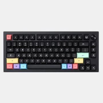
As a follow up to Yanbo's update, here's my official review and final photos of the keycaps.
https://mitormk.com/2017/07/08/mitos-updates-5/
Photos inside, go look!