Click to view our Accessibility Statement or contact us with accessibility-related questions


PRODUCTS YOU MAY LIKE
Trending Posts in Mechanical Keyboards

RealRage_TV
software?
Hi I'm new to Drop and i just received my Keyboard i have been waiting for months for by Drop x MTN Dew x Borderlands movie and didn't know if there was a software like Logitech's for the keyboards. if anyone could help please let me know
Nov 20, 2024

jdsvdropper
Drop ENTER keyboard with DCX Sleeper Mac variants and Rocky Bird
Black Drop ENTER keyboard with DCX Sleeper Mac variants for the Option and Command keys, and Rocky Bird red and black DCX keycaps.
Nov 19, 2024
AngryTank
Favorite Artisans
COME FORTH SHENRON!
Purple, Dragon Balls, and Seta! What more does a simple man need?
Nov 17, 2024
InsufferablePedant
ZealPC Aqua Zilents
Please ignore the filthy keyboard, it's been on a shelf for a minute.
Nov 15, 2024

Neekolas714
Kicks & Keebs
Alpha Bravo Smoke
Finally finished my Keychron V5. Smooth, beautiful and stylish. What else could there be?
Nov 13, 2024
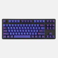
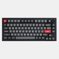
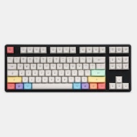
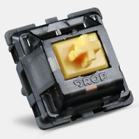
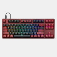
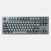
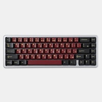
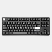
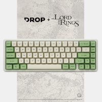
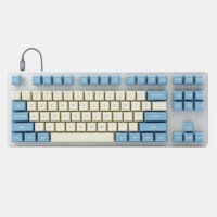


LOL, I wonder how many folks here actually lived through the 70s and experienced it first hand?
This is a cool tribute to the decade, but the overall day-to-day design gestalt of the period was pretty dismal, IMO. Anyone remember those avocado green carpets and appliances, and those suffocating wood panelled dens? Now imagine if everything in your house had those kinds of colors.
Sure, they can look cool when you see some really prime, curated examples of them. But the average examples were really dreary and almost depressing. There's a reason why folks immediately tear out the kitchen of a house with a 70's kitchen. There was something so dark and closed-in about that decade's pallet.
But nostalgia is what it is, and here is a good tribute to that time, albiet a more cheerful and poppy version than the real colors of that period. Oh, the 70s!
BUT ABOUT THOSE KEYS AGAIN: Like many, I've never used SA caps - are they too tall for small boards? (thinking specifically of the plank)
Regarding the SA profile caps, I just recently got my first SA set, myself. It is the Danger Zone set which dropped here a while back.
While I don't have a Planck, it put it on my Poker 3, which is a 60% board. So fairly compact.
I love it. SA is noticeably taller than the stock keys. But the whole upper surface is raised, all keys, so there's no issue with typing. In fact, I like the feel of these caps and the typing experience much more with SA than with the stock caps.
If anything, it may affect the height differential between the table top, where your wrists are resting, and the upper surface of the keys. The differential will be higher with SA, of course.
Whether this will have a negative, positive, or no effect on how good it feels and how well you type is up in the air. It might be different for different folks.
At worse, you could use one of those foam or wood wrist rests if you find the SA keys feel too high with your wrists on the bare table.
Personally, I think SA feels great. I like them better than DSA, which feel somewhat low and flat to me. And in the case of the Poker 3, I like SA better than the stock keycaps, as well.
As for the Danger Zone SA keys, it's a great set! I'm glad I got it. I only wish I knew what ErgoDox was back then as I'd love to have purchased the AeroDox pack at that time.
But I'm in for the ErgoDox set here. I'm really looking forward to it.