Click to view our Accessibility Statement or contact us with accessibility-related questions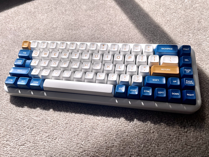


Inconsistency in font between the top row number keys and the base keys, the base keys are thicker in bold then the top row number keys. Other than that, overall a beautiful set!

search
close
Sort by: Newest
keyboard_arrow_downLet’s get the conversation started!
Be the first to comment.
Trending Posts in Mechanical Keyboards

lantz
Red Samurai on a 75%
Corsair K65 Plus Wireless GMK Red Samurai Moondrop Tactile Tessence
Apr 19, 2024

Keyled
My PRECIOUS!!!!
All that sweat and money paid off. I will use it wisely. Tokyo 60 GMK Serenity Gateron Oil KIng
Apr 19, 2024

TotallyJaded
How do you do per-key RGB lighting on a Shift V2?
I saw the online configurator that lets you do this on the Shift V1, where it spits out a compiled firmware file to flash. The V2 doesn't seem to have this function in the Windows configurator, though. I can't imagine the answer here is "you're going to have to manually write the hex for every key in QMK, compile it, and flash that".
Apr 18, 2024

AiheyStudio
Favorite Artisans
Dragon Pillar Artisan Keycaps Creative Resin Keycaps for 6.25u and 7u Space Bars
Discover the allure of our Dragon Pillar Artisan Keycaps – unique resin keycaps designed to adorn your 6.25u and 7u space bars. Crafted with creativity and precision, each keycap features an...
Apr 18, 2024


lwthunder
Drop CTRL V2 Mechanical Keyboard PCBA
If I want some hot-swap socket for replacement, where I can buy to ensure it fits this PCBA?
Apr 17, 2024
Drop Refurbished
Like-new products you can trustDrop Rewards
Get $5 for every 500 points you earn! Learn more
Drop Keyboard Club
Become a member and expand your keycap collectionCollaborate With Us
For Brands & DesignersFollow Drop