Click to view our Accessibility Statement or contact us with accessibility-related questions


How To Design A GMK Keycap Set: An Introduction
search
close
Sort by: Newest
keyboard_arrow_downTheAshenBlade
4
Sep 14, 2023
Sorry I'm a little late, great article! How much does it typically cost to create your own keycap set? And where do you typically get the keycaps manufactured at or submit the designs to..?
Lexxed
29
Dec 29, 2022
Nice article.
Another part on font selection would be good.
I still want a decent set with comic sans
sietai
154
Keyboard Club Member
Dec 15, 2022
@GMK_Andy I’ve own 3 sets of Jukebox keycaps lol (and it’s the only color scheme I have multiples of). Not sure how ownership of the color schemes work or if you had involvement is Tao-Hao and Mt3 jukebox, just wanted to say I’m a fan!
Ryan_V
12
Dec 15, 2022
Fantastic article, I'm already looking forward to the remaining pieces of the series. I'd say if there was one element to the hobby that I'd want to wear my Contributor Hat on, it'd be making a keycap set. This is highly informative. Thanks.
(Edited)
GMK_Andy
151
Dec 17, 2022
Ryan_VPlease let me know if you have any stuff you want to specifically hear about!

SIMOROBO
86
Dec 14, 2022
It would be interesting to know the implications of making a set such as the header image wob katakana where every alpha key was, I'm assuming, a custom mold. Do you need to run a group buy with 2x, 10x, 100x more sales than a conventional set?
SIMOROBO
86
Dec 14, 2022
Are there colors that are known to be more problematic or even impossible to achieve?
bcusynot
1
Jan 17, 2023
Specifically, what is a hyper-neon color you are unable to produce? And, is a not fully mixed plastic effect achievable on a GMK set?
GMK_Andy
151
Jan 17, 2023
bcusynotWhat do you mean? If you're selecting RAl or Pantone generally we can do it all, the neons being the exception due to materials in them.
No, we get our raw materials from a supplier in Germany that specializes in making and color matching the material. It comes mixed.

lfchawkeye
35
Dec 14, 2022
What is the expected production lead time on a GMK keyset these days? Is there a list of sets currently in production queue, by chance?
GMK_Andy
151
Dec 18, 2022
Yup! I will have actual numbers in a post after the holidays but we are producing ~2x the number of caps per month, as compared to last year at this time (~4-5 million caps compared to ~2.5 million) along with just adding a new sorting machine that will greatly improve the accuracy and speed at which sets can be sorted (this was a bottleneck). As I mentioned, I will provide real data here in a large post I'll share across communities after the holidays when the team has time to pull the real numbers for me.

rfmarves
3
Dec 14, 2022
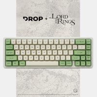
What is that disk-like thing shown in the main picture, right above the keyboard?
GMK_Andy
151
Dec 17, 2022
rfmarvesProbably a metal tin that an artisan shipped in?
Honestly, not sure though!
Showing 20 of 27
PRODUCTS YOU MAY LIKE


Trending Posts in Mechanical Keyboards

kali.shadowOps
MT3 9009 - CTRL Hight-profile
Drop MT3's are my favorite keycap format. complete my Dark-purple CTRL and my TKD Cycle7 nicely..
May 31, 2024

ThereminGoatMK
Not All Linears Are The Same!
Figure 1: Not even all of these (mostly) KTT-made linears are the same! After all of my years of collecting, reviewing, and obsessing over switches, I can say with certainty that linear switches are the most misunderstood of all of the switch types. No, I’m not talking about mechanically either, as all of the claims of them “just going straight up and down” are somewhat kind of true. (Not too much though, don’t get that excited.) The part that is often misunderstood, though, is usually in what is being implied when people say that these switches just go straight up and down – “All linears might as well be the same.” If the title of this article didn’t make that obvious enough to you, I find that sort of idea to be completely and utterly wrong. The people who make these implications wouldn’t say that a Cherry MX Black is the same as a Novelkeys Cream switch? They also certainly wouldn’t ever claim that every Gateron-made linear is the same as every fancy TTC one out there...
May 29, 2024

Ike4948
Have you noticed the flaw in the Shift V2 case?
I recently decided to try adding screw-in stabs to my Shift V2. As this was my first time adding screw-ins, it took me about 45 minutes to get them on the PCB. The next hour was then spent unsuccessfully trying to get the PCB to sit nicely in the top of the case. I started unscrewing some of the stabs, trying to figure out which one was the problem. I did also manage to figure out that it's best practice to have the screws a little loose when you go to pop the PCB in the case. But that only worked for four of the five stabs. The fifth stab, the Num Enter stab, would sit properly. Once I got it narrowed down to that stab, I started looking at the case itself. That's when I found the problem. There is a little post that interferes with the screw-in stab's screw (pictures included; you can see the damage from the screw being mashed into the post). I assume this is a carryover from the V1 case, for which the included PCB did not have holes for board mounted stabs. So now the questions:...
May 26, 2024

DarthChalupa
Nice keys, my phone camera sucks.
The black makes the shine-thru really pop, and I find goes well with most light colors. Unfortunately you'll have to take my word for it, because my camera has crap light settings I can't change.
May 26, 2024

miles.chatterji
Favorite Artisans
SA Carbon Drop + T0mb3ry
SA Carbon Drop + T0mb3ry on Tokyo60 in Coyote.
May 24, 2024
StormyTheCat
Recommendation needed for better locator (F & J) keys for Cherry MX OEM Profile keyboard
I keep losing the location of keys on new DAS 4 Pro Keyboard. i.e. My hands can't tell if they have shifted left or right a key. The keyboard has Cherry MX Brown OEM profile 104 keys. I'm looking for new keycaps to help my fingers better locate the F & J keys. I've been a touch typist for decades (going back to the IBM Selectric) but have been using MS Ergonomic 4000 keyboards (no longer available) since the 90s. The stretched G & H keys on that keyboard likely contribute to my having some difficulty getting used to a standard layout. I'm looking for either a more pronounced "bump" on the locator keys or I've heard about keys that are more spherical and the F & J keys are a deeper depression (MT3?). I've found that a touch typist position with more vertical fingers completely missing the bump on my DAS keyboard F & J keys. How do the different profiles change the keyboard. i.e. Can I use a few MT3 keys with my OEM keys? I have all black keys now, and am not looking to go...
May 23, 2024

Colorcrow
Battlestations
The Elven Kingdom
My (finally) complete set for my desktop. A map of the Lord of the Rings as a mousepad, some wooden wrist rests, and of course the LotR Elven keyboard along with the keycaps for a numpad.
May 22, 2024
Drop Refurbished
Like-new products you can trustDrop Rewards
Get $5 for every 500 points you earn! Learn more
Drop Keyboard Club
Become a member and expand your keycap collectionCollaborate With Us
For Brands & DesignersFollow Drop
Basic Overview: Designing a keycap set from start to finish Creating a keycap set may sem deceptively simple, but there is actually quite a bit of nuance that goes into creating a successful set. To kick things off I want to provide a basic overview of the entire process, and I’ll be going further into detail on each aspect in subsequent posts. In these subsequent posts I will be concentrating exclusively on the requirements for creating a GMK keycap set, but in this introductory post I will speak in broader terms. I think it is important to understand all the choices you have when designing a keycap set.
Novelty Keys At the same time the IC ins happening, you should also be working on any novelty keys, new fonts, or special keys you want to add to the set. Not every set will need special keys (my old set GMK Honeywell was awarded the Deskthority “Set of the Year” for example, and it included no special keys or novelties). When designing novelties, be aware of any protected materials, especially if you are designing a set based off of an existing work (like a movie, book, show, etc). When designing new legends you need to keep in mind a few important details – most important what the specific manufacturing tolerances are for the caps you are using. For example, if you are creating a doubleshot keycap set, you can’t have novelties with more than 2 colors, or shading. Colors The final consideration for this stage is selecting the colors that will be used. This is often a deceptively hard part of the process. When selecting colors it is best practice to use either RAL or Pantone, with RAL being preferred as it is intended to be used for plastic manufacturing. When working with colors there are a few things you should be aware of. First – make sure you calibrate your monitor, and always check your work on as many different screens as possible. If you are using a “gaming mode” or some high contrast mode, turn it off. Colors on the screen never translate perfectly to how colors will look in real life, which is why I always suggest getting sample plastic chips if possible. Anytime I use pantone colors I always get the samples. These allow me to look at the colors and contrast between the colors in a variety of lighting. Buyers will always want to know the specific colors used in any set – so having this information readily available is quite important.
Packaging Now that the design process is wrapping up all that is left to do is design the packaging and get the required files to the vendor so that they can place the order. Different manufacturers each have their own packaging, but templates should be readily available. Mod Edit: Formatting