Click to view our Accessibility Statement or contact us with accessibility-related questions


Building Tribute Boards: the art of imitation

search
close
Sort by: Newest
keyboard_arrow_down
HoffmanMyster
3001
Community
May 15, 2024
Fantastic write-up! I hope this serves as inspiration to anyone looking to build up their own themed board/setup. 👌
I will say, I was a little bummed to see a hyperlink behind the text "married in Klingon" and learning that it was not, in fact, your own wedding. 😅

storyboardtech
395
Keyboard Club Member
May 16, 2024
HoffmanMysterIt took years to get her into Trek. Her dad was a big trekkie, but some people need to warm to it.
Related Posts

storyboardtech
Building Tribute Boards: the art of imitation
“Anne Marie? Do the interns get Glocks?” asks Steve Zissou (Bill Murray) in Wes Anderson’s classic The Life Aquatic with Steve Zissou. “No” she replies without pausing from looking up from sunbathing… “they all share one.” If you’re new to director Wes Anderson and his collection of artsy, charming, and sometimes problematic but otherwise entertaining films, The Life Aquatic is a good place to start. Not because it’s his best work (The Royal Tenenbaums) or even his most approachable (The Fantastic Mr. Fox) … but because it is all of the things I described above and is a perfect example of what a Wes Anderson movie is. The actors, who make up his all-star casts are reduced (if that term can be used this way) into extensions of Anderson’s creative mind and play their parts to perfection. The plot is funny and also tragic, the music in the movie is completely unique and also instantly recognizable (Portuguese covers of David Bowie songs) and the movie blends dialogue and...
May 15, 2024

dovenyi
What is SpaceFN and why you should give it a try
The SpaceFN concept - setting up your space key as a layer switch when held - is probably one of the most useful tweaks in the keyboard hobby. Let me explain how it works. My SpaceFN article on kbd.news made some rounds recently - quite surprisingly given the age of this concept. This piece you're reading is a condensed version of the full post. If you're left with unanswered questions, you'll most likely find the info you're looking for in the original write-up. On my imaginary top list of the most useful keyboard features, tweaks and hacks, SpaceFN would deserve a podium finish for sure. But what makes it so special? In short: SpaceFN is easy to implement, easy to learn, costs nothing, can be used with any keyboard, and can improve your productivity instantly. I will list its benefits below, but can state right at this point that the SpaceFN concept, setting up your space key as a layer switch when held, is clearly one of the most useful tweaks in the keyboard hobby....
Apr 30, 2024

dvorcol
Support for Alternative Layouts
This is a summary of how alternative layouts have been supported by kits such as Colevrak and Homing. It is not a discussion of alt layout performance and development, but if that interests you I highly recommend starting with Pascal Getreuer’s A guide to alt keyboard layouts (why, how, which one?). It’s a concise and comprehensive overview with links to some great sites that go deeper. He also has a separate Links about keyboards page. The Keyboard layouts doc he recommends explains layout goals and metrics in detail, summarizing the alt layouts discussed here as well as more than one hundred others. Sculpted-profile The majority of custom keycap sets are sculpted-profile (Cherry, SA, MT3, KAT, etc. - more on profiles generally here) so let’s start there. Because each row has a unique keycap shape, alt layouts require a unique keycap for each legend that moves off its QWERTY row. At first there were two The Dvorak layout was patented in 1936 by August Dvorak & William L....
Apr 23, 2024
ThereminGoatMK
Do I Need to Lube My Keyboard Switches?
Figure 1: Sometime around here is a good time to ask that question... If you’re new to the mechanical keyboard hobby, I have no doubt that planning your first keyboard build is a bit of a daunting task. To be entirely honest with you, it’s only a tiny bit less daunting for your second or even third keyboard builds should you stay around a little while longer. You’ve got the keyboard itself to worry about, stabilizers, keycaps, and even switches on top of all of the intangible marks you want your dream keyboard to hit. Switches are especially daunting right out of the gate as there’s just so many options out there to pick from – each with their own unique specifications, manufacturers, and more. Yet, in spite of all of these differences between switches, time and time again I find people always asking about lubing switches as one of their chief concerns when it comes to picking some up. With countless numbers of content creators talking about lubing switches, its no...
Apr 17, 2024

HoffmanMyster
DCX vs DCD vs DCL - Drop’s Keycap Profiles Explained
We’ve covered the basics of keycap profiles before—spherical/cylindrical, sculpted/uniform, etc. One thing that has come up more and more over the years as we’ve expanded our portfolio of offerings here at Drop is the distinction between some of our similar profiles. Specifically, what is the actual difference between DCX, DCD, and DCL? Cylindrical Profiles To recap the previous article on the topic, one of the most basic ways to separate various keycap profiles is by shape (cylindrical, spherical, or flat). DCX, DCD, and DCL are all cylindrical profiles. The most famous cylindrical profile is Cherry profile, as defined by the original manufacturer of the keycaps—Cherry. GMK now owns those tools, and as such, only they can technically claim to produce “Cherry” profile keycaps. Similar keycap profiles are often called Cherry profile colloquially, but are in actuality slightly different. For the sake of not splitting hairs, all of the cylindrical profiles discussed here are...
Apr 9, 2024
cobertt
3 or 5? How many pins does your switch really need?
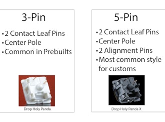
One of the oldest questions, albeit one you don’t see very often anymore, is about 3-pin and 5-pin MX switches. Early in the custom switch scene, budding enthusiasts would need to determine whether their keyboard needs 3-pin or 5-pin switches. Today, the question doesn’t appear as often as it used to, but it is still important to know the difference and when one is a better choice. The difference between these two types of switches is in the name, the number of pins. As seen in the pictures below, 3-pin switches have two metal legs for the contact leaves and registering of switch presses as well as the stem pole. These switches were traditionally called plate mount switches, as they relied on the plate to align the switches on the PCB. 5-pin switches have the same contact pins and stem pole but are also accompanied by two additional alignment pins on the left and right of the stem pole. These were called PCB mount switches, as they could be used without plates as the PCBs would...
Apr 2, 2024
Trending Posts in Mechanical Keyboards
ThereminGoatMK
Not All Linears Are The Same!
Figure 1: Not even all of these (mostly) KTT-made linears are the same! After all of my years of collecting, reviewing, and obsessing over switches, I can say with certainty that linear switches are the most misunderstood of all of the switch types. No, I’m not talking about mechanically either, as all of the claims of them “just going straight up and down” are somewhat kind of true. (Not too much though, don’t get that excited.) The part that is often misunderstood, though, is usually in what is being implied when people say that these switches just go straight up and down – “All linears might as well be the same.” If the title of this article didn’t make that obvious enough to you, I find that sort of idea to be completely and utterly wrong. The people who make these implications wouldn’t say that a Cherry MX Black is the same as a Novelkeys Cream switch? They also certainly wouldn’t ever claim that every Gateron-made linear is the same as every fancy TTC one out there...
May 29, 2024

Ike4948
Have you noticed the flaw in the Shift V2 case?
I recently decided to try adding screw-in stabs to my Shift V2. As this was my first time adding screw-ins, it took me about 45 minutes to get them on the PCB. The next hour was then spent unsuccessfully trying to get the PCB to sit nicely in the top of the case. I started unscrewing some of the stabs, trying to figure out which one was the problem. I did also manage to figure out that it's best practice to have the screws a little loose when you go to pop the PCB in the case. But that only worked for four of the five stabs. The fifth stab, the Num Enter stab, would sit properly. Once I got it narrowed down to that stab, I started looking at the case itself. That's when I found the problem. There is a little post that interferes with the screw-in stab's screw (pictures included; you can see the damage from the screw being mashed into the post). I assume this is a carryover from the V1 case, for which the included PCB did not have holes for board mounted stabs. So now the questions:...
May 26, 2024

DarthChalupa
Nice keys, my phone camera sucks.
The black makes the shine-thru really pop, and I find goes well with most light colors. Unfortunately you'll have to take my word for it, because my camera has crap light settings I can't change.
May 26, 2024
miles.chatterji
Favorite Artisans
SA Carbon Drop + T0mb3ry
SA Carbon Drop + T0mb3ry on Tokyo60 in Coyote.
May 24, 2024

StormyTheCat
Recommendation needed for better locator (F & J) keys for Cherry MX OEM Profile keyboard
I keep losing the location of keys on new DAS 4 Pro Keyboard. i.e. My hands can't tell if they have shifted left or right a key. The keyboard has Cherry MX Brown OEM profile 104 keys. I'm looking for new keycaps to help my fingers better locate the F & J keys. I've been a touch typist for decades (going back to the IBM Selectric) but have been using MS Ergonomic 4000 keyboards (no longer available) since the 90s. The stretched G & H keys on that keyboard likely contribute to my having some difficulty getting used to a standard layout. I'm looking for either a more pronounced "bump" on the locator keys or I've heard about keys that are more spherical and the F & J keys are a deeper depression (MT3?). I've found that a touch typist position with more vertical fingers completely missing the bump on my DAS keyboard F & J keys. How do the different profiles change the keyboard. i.e. Can I use a few MT3 keys with my OEM keys? I have all black keys now, and am not looking to go...
May 23, 2024
Colorcrow
Battlestations
The Elven Kingdom
My (finally) complete set for my desktop. A map of the Lord of the Rings as a mousepad, some wooden wrist rests, and of course the LotR Elven keyboard along with the keycaps for a numpad.
May 22, 2024

lrddd06
Kicks & Keebs
First dive into the DCX
My first sets of high-end keycaps, really excited to use them
May 21, 2024

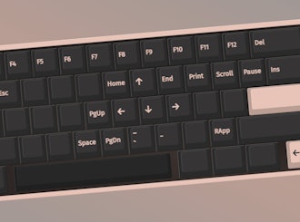
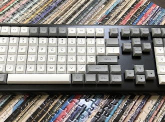
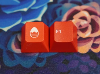


Deep cuts and deep dives In The Life Aquatic, the Belafonte is Steve Zissou’s ship, a rehabbed long-range sub-hunter from World War II transformed into a science vessel. The Belafonte carries Steve and his crew around the globe on oceanic adventures. While the Belafonte as a ship is impressive, (see this tour Steve gives in the opening sequences,) the Belafonte as a set is incredible. Anderson built a terribly ambitious and creative set, bisected horizontally to resemble a giant dollhouse. By doing so, the camera can pan up and down the ship following characters as they ascend and descend ladders, move between rooms, and dive into the deep. The ship itself is a character in the movie, with a story and a past. Above decks, scrawled on the side of its tiny yellow sub is the crossed-out name Jacqueline. “What happened to Jacqueline?” asks Ned, Steve’s potential son played by Owen Wilson. “She didn’t really love me” replies Steve nonchalantly. It’s almost like the boat has a regrettable tattoo, and on GMK Belafonte, “Jacqueline” is scrawled across the enter key. An obscure reference from a momentary line in the movie, is now an iconic symbol that instantly connects the keycap set to its namesake. Deep cuts like that are exactly what building a tribute keyboard is all about. Striking the delicate balance between honoring something and going overboard.
When it’s done right The reason “Jacqueline” works in GMK Belafonte is the same reason printing “The Life Aquatic” or “Zissou” on the keycap wouldn’t. Rather than saying exactly what it is, Mito used a non-obvious reference, hinting at a subtle memory that captured the spirit of the film, rather than clubbing us over the head with it. That kind of subtlety is what this set does so well and like anything, doing something well often looks effortless but is actually really hard to do. The truth is, almost every accent key in GMK Belafonte is brilliant. In the movie, two dolphins accompany the ship, and Belafonte has dolphin 1.5u and 1u keys, each with a “1” or “2” next to the dolphin. There’s a handgun key, referencing the line I opened this article with. There are life preservers, scuba gear and anchor icons, all subtle, clean designs that work together perfectly. The triple Z logo of Team Zissou is replicated in R5 height for use as an escape key or F13 accent in white on red, blue on yellow and yellow on blue! There’s a charming 1.75u “Black Box” key that while not referenced in the film, fits right in. The only keys I don’t care for are compass-rose styled arrow keys. They just seem a little over the top and a bit too nautical. When it’s not Last year, a friend of mine was working on designing a keycap set themed to appeal to record collectors. He saw a connection between people that own vinyl and keyboards, and I think he’s on to something. I love both of those subjects, and am solidly in his demographic, but I disliked the renders he posted on a Mechanical Keyboards Facebook group we both belong to. I felt they were obvious, clumsy and off-putting. The set was called “Vinyl Records” (a term that any vinyl collector would never say,) and it used iconography that loosely referenced all record usage, ever. (It had a phonograph on one of the enter keys). Rather than using insider knowledge to “nod” at familiar visual references, it trumpeted things no vinyl enthusiast would be proud of. I was in a mood apparently and decided to give a full “review” of the set from “S-tier” to “I have no words”. The most successful keycap in the set in my opinion was a black 1.5u cap with a printed on/off switch in white and a small, red power indicator. It was fun, something that’s really hard to do well in keycaps. The set is primarily white on black, with some white and red keys mixed in. It has a very White Stripes appearance, which makes a ton of sense when you think of all Jack White has done for the vinyl market. Chester was really gracious and said that they’d take the feedback into account and come back with something stronger, and they did. Several months later I received a set of the final “Vinyl” in the mail, and it’s pretty great! They evened out some of the overtly pandering terms or symbols, toned the whole set down a bit, and added a few, really nice elements. Like a white on red tonearm UK enter key. Here's my Bakeneko65 with the final product.
Using color by itself to theme your board In GMK Belafonte, the colors of the keycaps themselves only hint at the nature of their inspiration, and without the accent keys, I don’t think I’d ever have guessed the theme. Only with accents and artisans do the keycaps suddenly make sense as a movie-themed board, and that brings us to the subject of color use and color-grading. Color grading is the use of software and post production tools to manually edit color in a film to create an overall look and feel. Most movies use some level of color grading to keep the film consistent, but the result is usually geared toward looking realistic. In some Sci-Fi, like the new Dune movies, it’s used really creatively to make the films seem otherworldly. A key example is the trippy infrared Harkonnen homeworld in Dune 2. Or the inky comic style of Frank Miller’s 300. While it’s not fair to boil Wes Anderson’s aesthetic down to the color usage in his films, the effect color grading has on them is unmistakable. It’s entirely possible to present a Wes Anderson fanboy with a handful of colors and have them successfully name the film.
Artisans really tie it all together I mentioned all of the accent keys I love in GMK Belafonte, and how they’re so good at communicating the themes of the film, but my crowning jewels on my Belafonte keyboard are two artisans that were never in a million years intended to “go” with this set. With a little bit of creativity, these two keys make my Life Aquatic keyboard one of my favorite builds. The first artisan is the M.7 aluminum tab keycap. Sold here on DROP for quite some time, I have it in a robins egg blue. It’s a 1.5u television screen, with a removable magnetic face, that allows the user to swap out any number of paper inserts to create a tv show/movie effect. The artisan itself comes with sheets of fun little paper inserts, but I printed several screenshots from The Life Aquatic and cycle through them. Currently I have an image of Steve pointing, which is iconic, but my favorite is a closeup of Willem DaFoe wearing the red beanie that the crew in the film are never seen without. Secondly, I use an artisan created to be used with the Vinyl set I mention above, a 1u turntable artisan from Keybay.tech in dusty tan, with interchangeable records! It is flat out adorable, and comes with a black, red and yellow record that can be swapped out by removing and replacing a tiny black tonearm.