Click to view our Accessibility Statement or contact us with accessibility-related questions


Showing 1 of 71 conversations about:

Marblecf1
19
Mar 2, 2019
bookmark_border
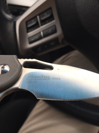
Hey massdrop let’s talk about your logo, I think a knife this beautiful should have a logo just as beautiful. You have done better logos before!
As seen here on the Ferrum Forge falcon you used a better logo that doesn’t come off so plain.
I think a lot of your customers would appreciate a higher quality logo, we are definitely willing to vote on it and this would increase customer satisfaction so much.
sincerely,
a loyal customer
Bknguyen
693
Mar 4, 2019
bookmark_border
Marblecf1What's funny is compaints about that logo brought on the one you see now!
Marblecf1
19
Mar 5, 2019
bookmark_border
BknguyenWell you can’t please everyone, but i think as a community we agree that the logo needs work
Toucan
65
Mar 6, 2019
bookmark_border
Marblecf1Strongly agree. Current Massdrop logo is cartoonish and a real eyesore, not appropriate for a knife and especially on a knife as clean and as elegant as this. They should consider redesigning their logo so that it resembles a maker's mark. If they keep the current logo on the Heat Seeker, we'll have a knife with a Jekyll and Hyde character between the show side/maker's mark and the lock side/Massdrop logo.
I've come across this same comment so many times here at Massdrop, where people keep repeating again and again that they love everything about the knife..... except the logo.
Davidsh331
284
Mar 8, 2019
bookmark_border
ToucanAnd, is it falling on deaf ears? Or is someone listening?
Davidsh331
284
Mar 8, 2019
bookmark_border
ToucanGood grief, I could build a space shuttle and fly to the moon in less than 5 1/2 months.
14themoney
1395
Mar 9, 2019
bookmark_border
Davidsh331 But could you do it if you couldn't use duct tape and bailing wire? I would change my mind several times over 5.5 months. That's almost as long as May to September. But not as long as May to December.
Davidsh331
284
Sep 18, 2019
bookmark_border
14themoneyHappy to... "We'll find out in about 5 1/2 months."
14themoney
1395
Sep 18, 2019
bookmark_border
Davidsh331I'm always getting my snide remarks in the wrong place. This was meant to be a response to toucan. But I heard you loud and clear. Tnanx!
Drop Refurbished
Like-new products you can trustDrop Rewards
Get $5 for every 500 points you earn! Learn more
Drop Keyboard Club
Become a member and expand your keycap collectionCollaborate With Us
For Brands & DesignersFollow Drop