Click to view our Accessibility Statement or contact us with accessibility-related questions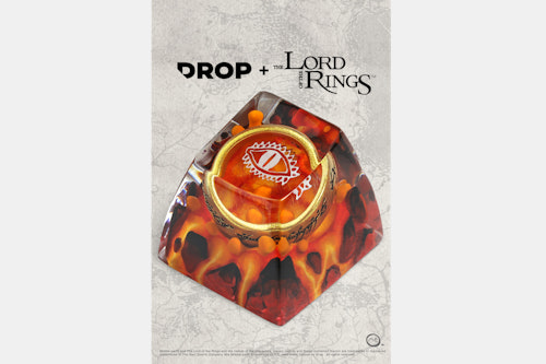


Drop + The Lord of the Rings™ The One Ring Artisan Keycap
$65
01 / 17
Drop + The Lord of the Rings™ The One Ring Artisan Keycap
bookmark_border
$65
Ready to Ship
·
Free Returns in USA
●
Members who purchase earn
195
Drop Rewards
Product Highlights:
Frequently bought together:
search
close
Sort by: Top Conversations
keyboard_arrow_downbobalover
90
Nov 19, 2021
The biggest suggestion I have here is remove the white glyphs from the Lava and Stream styles.
Sometimes less is more. The overall vibe of these artisan keycaps feels cheapened by their implementation.
Even if the eye was turned sideways to be more accurate, I still think the Lava cap would look nicer without it. Capture the moment, and focus on making the lava/magma pop (I've seen other artisan makers do 'lava'/'fire' a little bit better than what I can see in these photos).
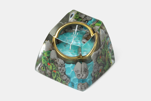
Similarly with the Stream, it would be far better without the sword. It would capture the tranquil beauty of nature/water, juxtaposed by the dangerous ring awaiting in the stream, waiting to be found. Bonus if you make the grey rock look a bit closer to the top half of a grey skull, to hint at the death that surrounds the rings' lore/power.
The forest ring is the only style I feel that is acceptable with the white script. I do wish there was a touch more organic detail in the scene (not too much, like a bit more green, like a fallen leaf or shroom/flower) to add a bit more vitality, because all I see is wood and moss. The way the branches end also seems incomplete (hollow and washed out), making them resemble look more like coral than branches/roots. Perhaps this can be masked a bit better, and with less colour loss. I guess you could partly rationalise that the ring cause decay around it or something, but I do feel darker brown wood tones would make the whole artisan look a bit more 'natural'.
MiTo
13956
MiTo
Nov 19, 2021
I agree 100% with you and all your points, thanks for sharing your perspective with such elaborate and well written, considerate reply.
psxndc
203
Jan 24, 2022
"(i.e. S-Craft Studio who does licensed Pokemon artisans has expressed how the rules under licensing significantly hamper their vision/details they want to include)."
My understanding is that S-Craft only did one or two rounds as officially licensed and then dropped it for exactly this reason - The Pokemon Company was exerting too much creative control. Such a shame too.
AgentXander
10
Nov 18, 2021
If that's the eye of Sauron, isn't that sideways from how it should be oriented? Only thing keeping me from pulling the trigger atm.
whomad1215
755
Nov 18, 2021
AgentXanderYeah, that eye is rotated 90 degrees.
Feels like all of the drop collabs are like 90% of the way to being fantastic, and then there's just a couple things wrong them them
(Edited)

lumipuppet
1
Nov 20, 2021
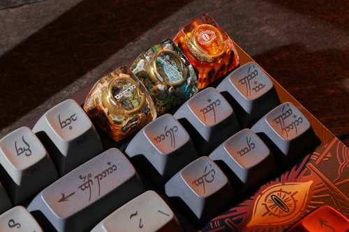
Hard disagree. Broken shards of Narsil narrows down exactly what the keycap represents. Otherwise, the three keycaps feel more like the three Elven rings (fire, air, water).


SmolBrotato
140
Nov 21, 2021
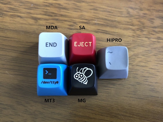
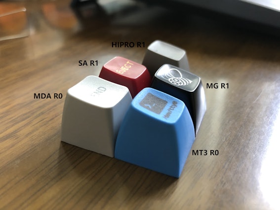
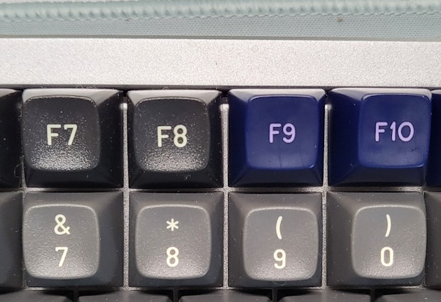
dvorcolI was impatient Soni had a friend send me a top down. It's the top down differences exist. Such as SA has a larger surface area vs MT3. But its small especially on clear resin
F7-8 are MT3 R0
F9-10 are SA R1
AlexPk
7197
Community
Nov 18, 2021
Stickied
On a personal level, gotta say I'm pretty excited that we got to work with Dwarf Factory and Middle Earth on this one. The One I should say. Ash nazg durbatulûk.
I was lucky enough to be amongst those who grew up reading these books and then enjoyed the experience of being able to see the midnight releases of the movies as they came out(just a couple years ago right?). Needless to say, the Lord of the Rings will always have a special place in my mind and memories.
And of course, as usual Dwarf Factory has made another beautiful piece of art that I think looks amazing. Not sure if the crew over there is into the lore as well, but the detail of the caps would imply as much. I especially appreciate the little details like the inscription only being visible in the presence of fire and (what I assume are) the broken shards of Narsil.
Trying to keep this one short, but big bonus points if someone can tell me what the inscription on the Stream Forest cap says.
(Edited)


AlexPk
7197
Community
Dec 2, 2021
an_achronismHahah sorry, I'm still here. This is just more difficult than I thought :|
edit: I think I got it
(Edited)
Ennead
20
Nov 29, 2021
Please either get rid of the eye of Sauron white symbol or at least rotate it 90 degrees so it would actually look like an eye instead of a vagina.


CookieWookie
8
Dec 13, 2022
Is the Eye of Sauron actually in the correct direction now? I see it's horizonal in the pictures but just wanted to confirm that's true for the product itself and isn't just a render.
LukasM
1655
Studio Team
Dec 13, 2022
CookieWookieYep we have corrected it to be in the accurate horizontal position now, not just a render.
hunkichunki
126
Nov 18, 2021
Was about to check out .. then WHAM! USD$15 for shipping......for 1 keycap.....no thanks
marcduck
29
Nov 18, 2021
hunkichunkiSeriously, the flat rate shipping is kinda insane. Especially since shipping usually takes over 2 weeks (why on earth does it take 2 weeks to send something from New Jersey to Toronto) , and then duties are also super expensive if you're not in the US.
Sorry for the rant lol

Showing 38 of 69
Recent Activity


Drop Refurbished
Like-new products you can trustDrop Rewards
Get $5 for every 500 points you earn! Learn more
Drop Keyboard Club
Become a member and expand your keycap collectionCollaborate With Us
For Brands & DesignersFollow Drop