Click to view our Accessibility Statement or contact us with accessibility-related questions$69$69100% would recommend to a friend 


Drop XDA Versa Keycap Set
$49
Drop XDA Versa Keycap Set
bookmark_border
$49
Ready to Ship
·
Free Returns in USA
●
Members who purchase earn
147
Drop Rewards
Customer Reviews
4.5
(11 reviews)
5star(6)
4star(4)
3star(1)
2star(0)
1star(0)
search
close
Images
keyboard_arrow_downSort by: Newest
keyboard_arrow_downhyperblowfish
0
Keyboard Club Member
Nov 4, 2024
checkVerified Buyer
Great Value
Really nice colors, tons of caps for the price, but like everyone else says, homing F and J are indiscernible from every other key. If you rely on tactile feedback from your homing keys, skip this set.
Recommends this product? Yes

ten.percent_carbon
5
Aug 10, 2024
checkVerified Buyer
Overall a nice clean XDA set
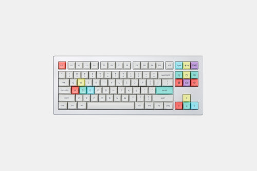
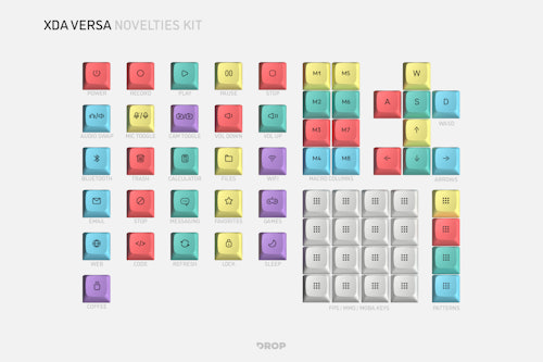
I have been looking for a PBT XDA set with uniform colors and this one checks all the boxes. The fonts are nice and crisp. The Novelites keys are nicely colored, not too bright and not too pale. Though since it comes in the 4 colors, you may not be able to get in a way you like.
The only complaint is the home row, the alt F and J key is very so slightly curved 'deeper' that its almost barely noticeable. I think it could have been curved deeper in to make it more noticeable.
Recommends this product? Yes

M.Yuhei-Japan
24
Jun 1, 2024
checkVerified Buyer
There are many varieties
I'm Japanese, so my sentences may be strange.
There are many types of keycaps available, so they can be used on a variety of keyboards.
I like that the surface of the keytops is rough, which makes them different from other keycaps.
Recommends this product? Yes

SirMontegu
0
May 27, 2024
checkVerified Buyer
Home row needs better tactile feedback
First, the font choice for the lengends on these is excellent. Very smooth and crisp, though there are a few spots where the characters are slightly imprecise, (e.g. the center line on one arrow key isn't exactly in the middle of the caret, the right/left angle brackets are perfectly aligned). As others have said the color is a warmer gray than it appears in the photos, but I find that makes the legends appear sharper. They also have a very nice texture on the surface.
The only thing I don't like is the home row indents. The base set did come with alternate F & J keys, but I could barely tell a difference between them. I ended up gluing a tiny piece from a bike tire patch to add extra feedback. The patches are clear so it doesn't look too bad, but it isn't elegant.
Recommends this product? Yes

getupbuzz
3
Keyboard Club Member
May 23, 2024
checkVerified Buyer
Nice novelties kit
Nice nov kit, nice macro keys. Unfortunally, the kit miss a mute key.
Recommends this product? Yes

Aristarco
209
May 20, 2024
checkVerified Buyer
Crisp legends, great texture, nice colors
I bought these sets because of the profile and the inclusion of odd sizes. They are great. They feel awesome to the touch and the legends look super sharp. Nice font choice, too. The colored pieces are excellent as they are not eye-piercing, but soft, almost pastel. If I had the resources, I'd buy four more sets to mod and use in my experimental builds. Great product!
Recommends this product? Yes

wudkeys
16
Keyboard Club Member
May 13, 2024
checkVerified Buyer
Cute, nice colors
Bought the novelties kit for my megalodon triple knob macropad. Love it!
Recommends this product? Yes

sstt
0
May 10, 2024
checkVerified Buyer
Good overall but texture is a little rough
Texture is like those shine through gaming pbt caps in the early days if anyone is curious.


Recommends this product? Yes
chrisgnickol
121
May 9, 2024
checkVerified Buyer
AIO kit in PBT priced decently? Say less.
I regret nothing. Only downside was the alphas leaning closer to beige than gray. Not a deal breaker by any means. 

(Edited)
Recommends this product? Yes

Theroc
2335
Keyboard Club Member
May 9, 2024
checkVerified Buyer
They are not nearly as bright as the renders.
I got this Versa set mostly because I was unhappy with beige shade of grey of the Canvas XDA alphas. Nothing against them, its just that they did not work at all with my snow-white Keychron Q5 Pro. The neutral bright grey Versa alphas looked like just the ticket.
Unfortunately they are markedly darker than advertised.
Here they are on my Q5 Pro paired with the Canvas Micons.


(Edited)
Recommends this product? Yes
Showing 10 of 11
Recent Activity


