Drop - Gaming Collaborations
Corsair
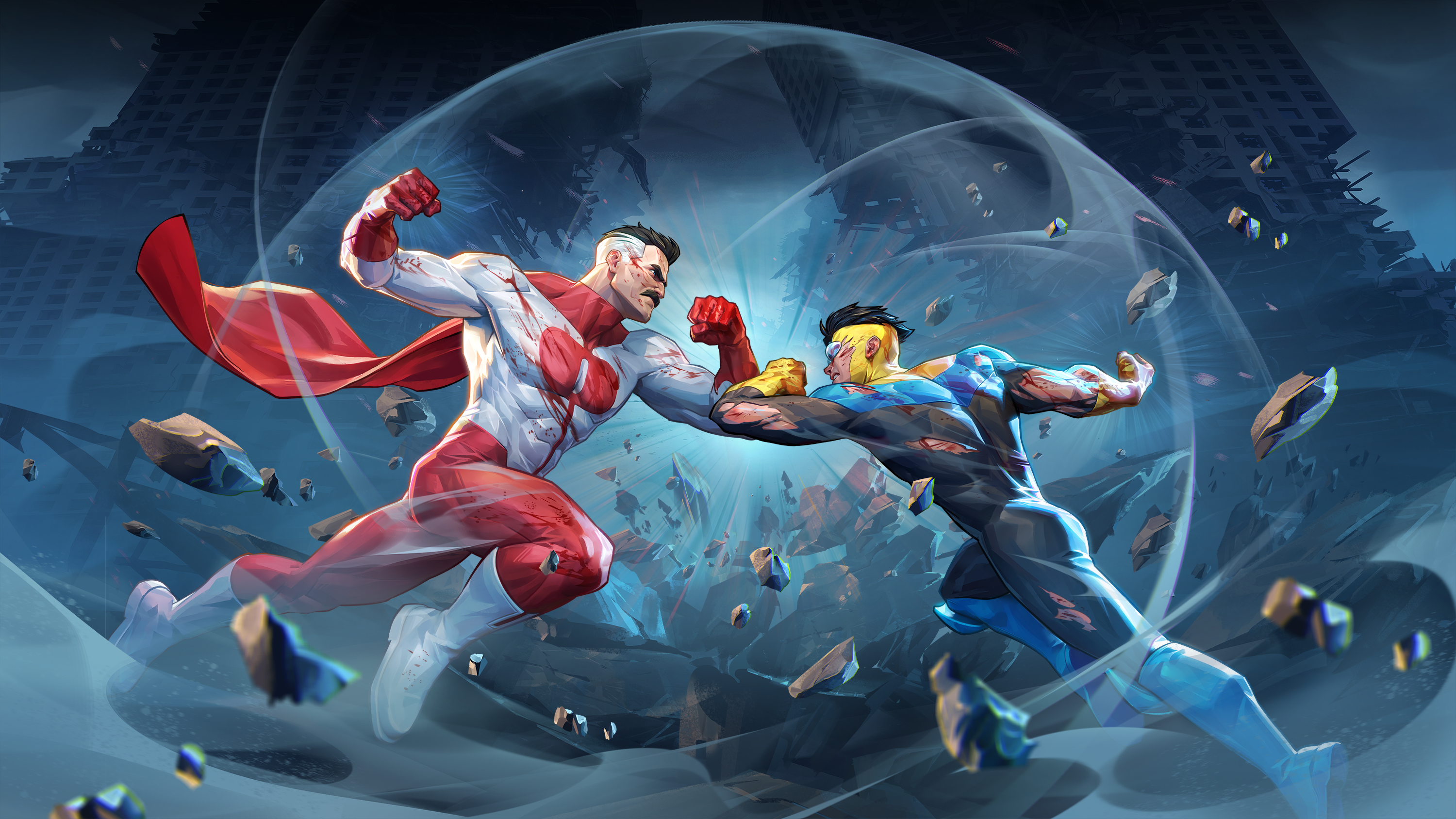
Invincible VS
Suit up for the carnage with the official CORSAIR x Invincible VS collection!
shopTo our Drop family
Starting our next chapter, drop.com will become a hub for our collaborations with truly exciting titles—from The Lord of the Rings™ and Cyberpunk 2077™ to Fallout Nuka Cola™, Doom: The Dark Ages™, and more—across the full CORSAIR family of brands.
This evolution allows us to focus on what we do best: bring bold ideas to life through partnerships that push boundaries and fuel passions. Check back here for release announcements, limited runs, and products inspired by you, our community.
Current collaborations
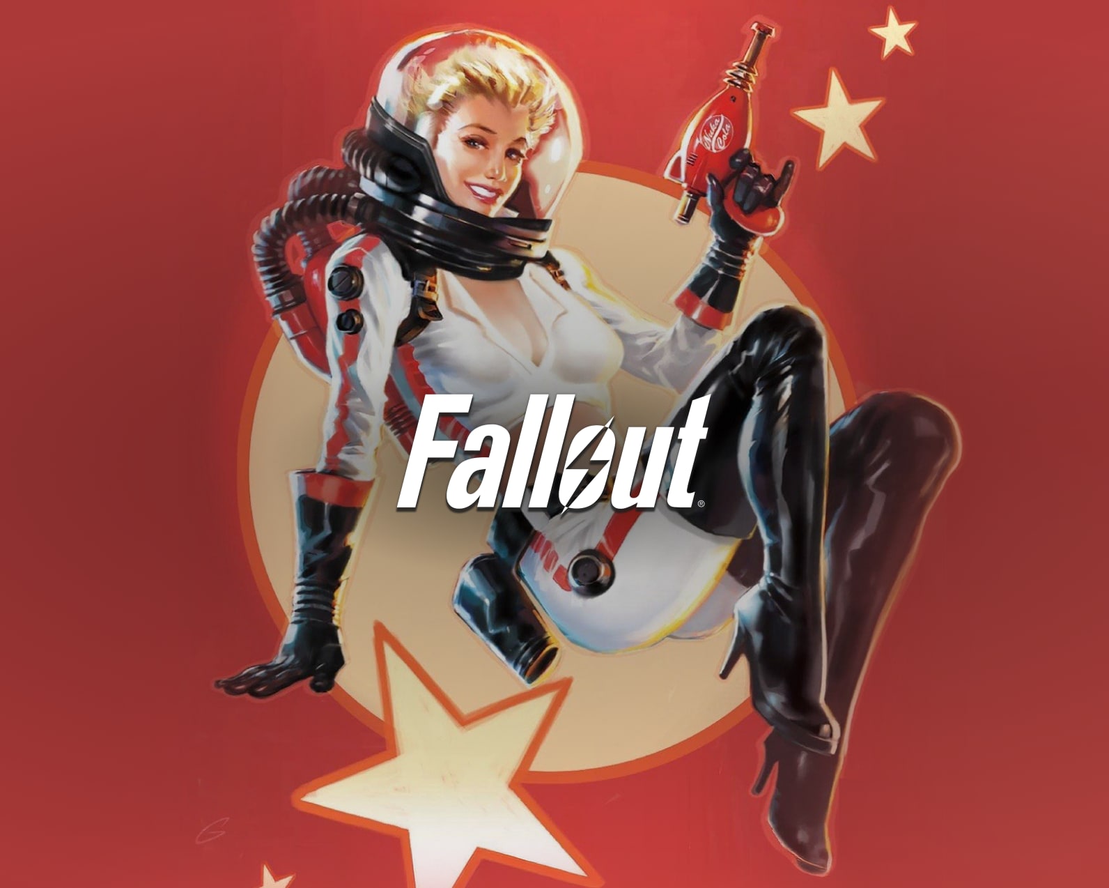
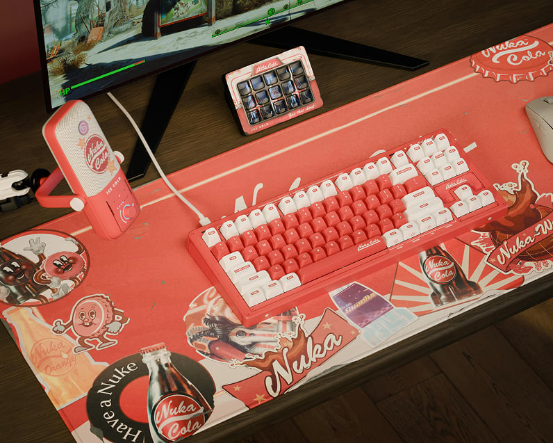
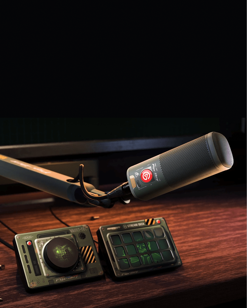
Fallout
CORSAIR
Elgato
FALLOUT: NUKA-COLA™
Every piece of gear is wasteland-ready, designed to give your vault that unforgettable Nuka-Cola™ flavor.
shop
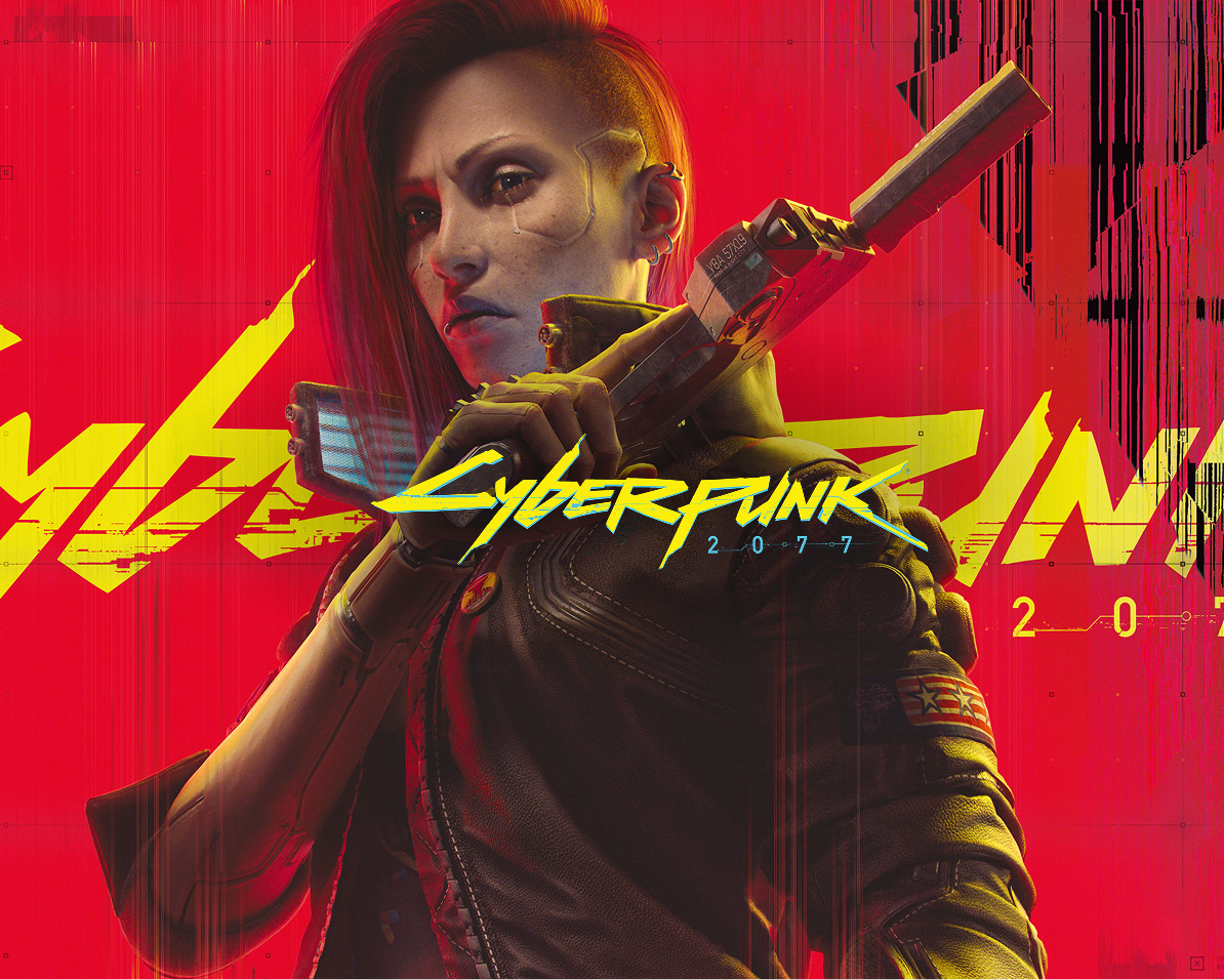
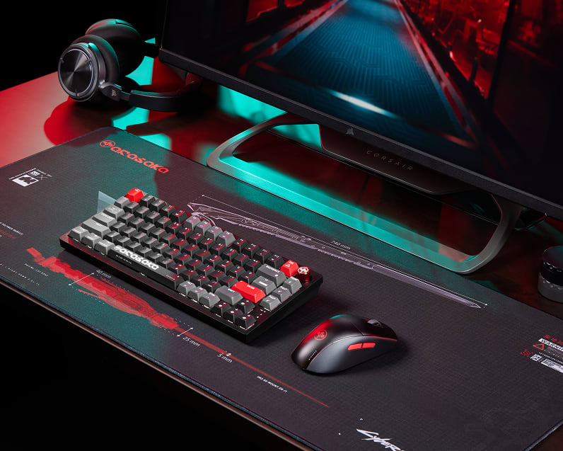
CyberPunk
CORSAIR
Drop
Elgato
CYBERPUNK: ARASAKA
Featuring highly sought after gear with Arasaka-grade tech. Acquire the assets, build your legend.
shop
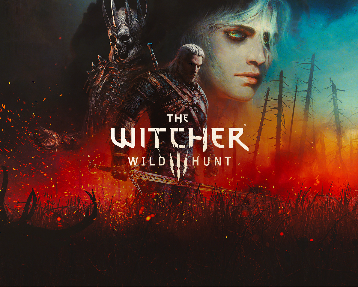
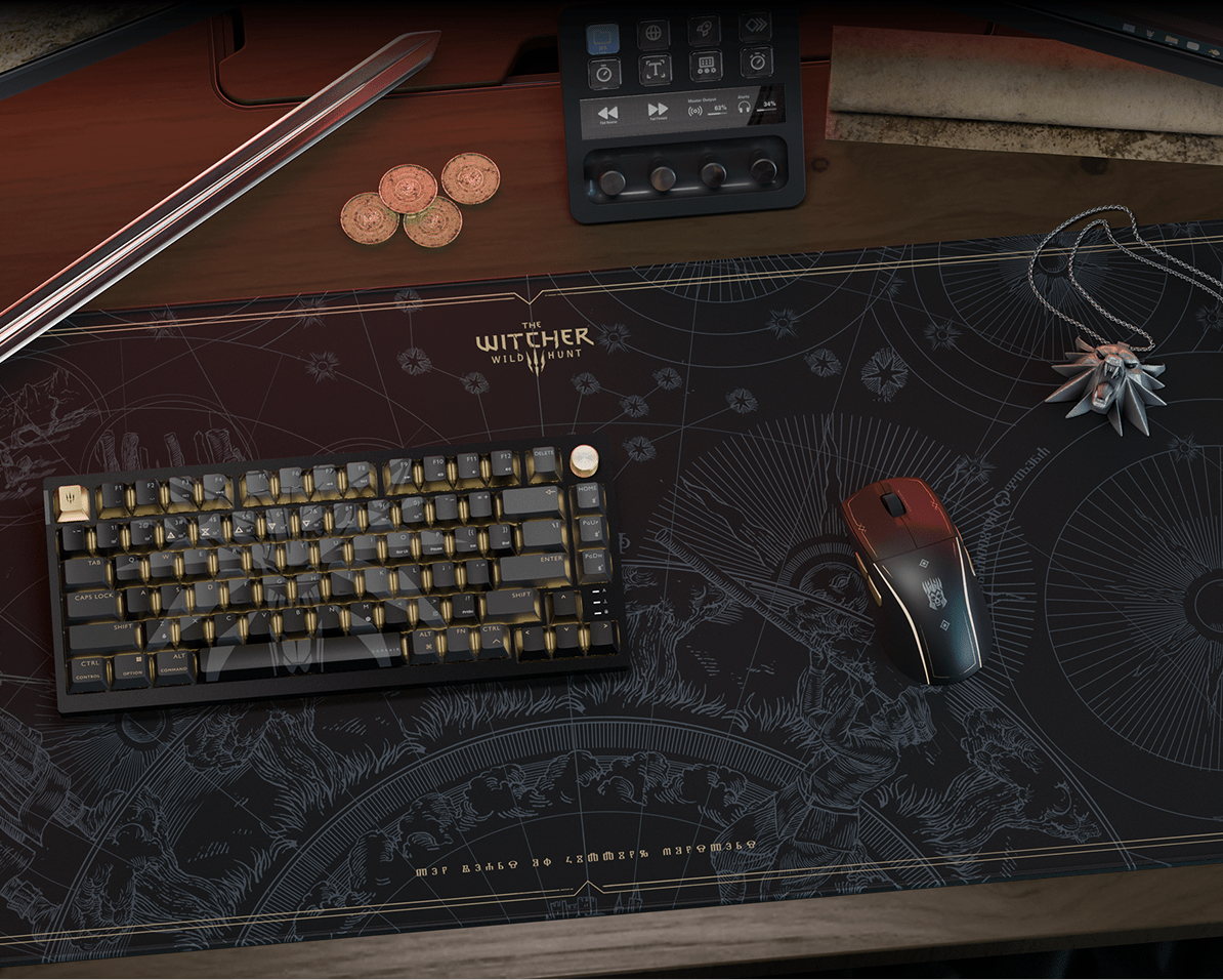
Witcher
CORSAIR
Drop
Elgato
THE WITCHER 3: WILD HUNT
All crafted to bring the legendary world and story of the White Wolf to your deskscape.
shop
Past collaborations
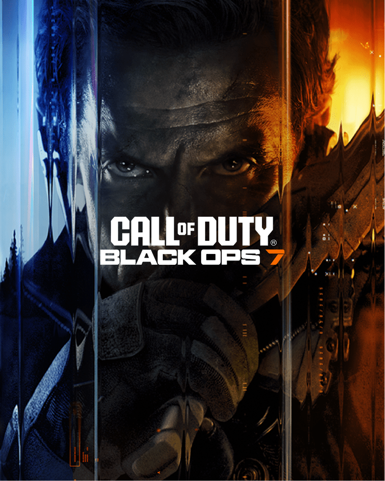
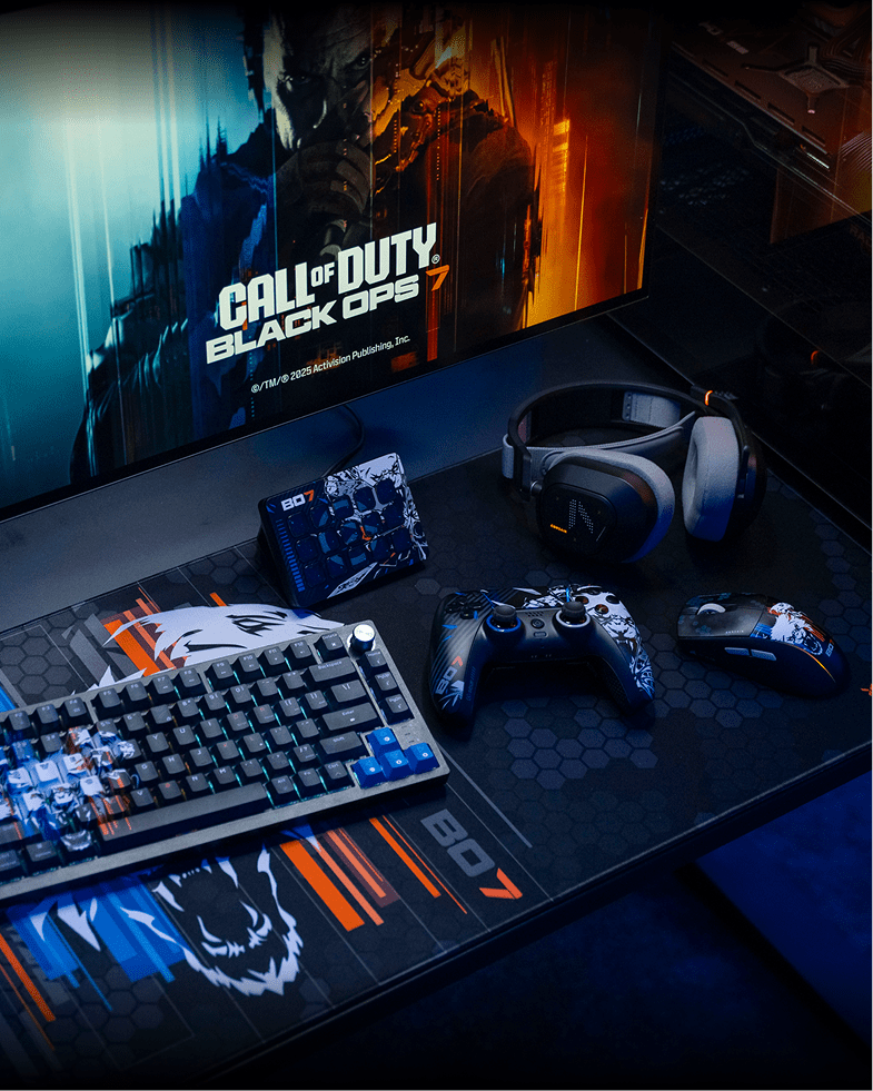
CALL OF DUTY™: BLACK OPS 7
The mission starts now. Embrace the madness and experience the most mind-bending Black Ops yet with the officially licensed CORSAIR x Call of Duty®: Black Ops 7 family collection.
Learn more on CORSAIR Learn more on Elgato Learn more on Scuf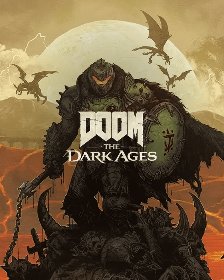
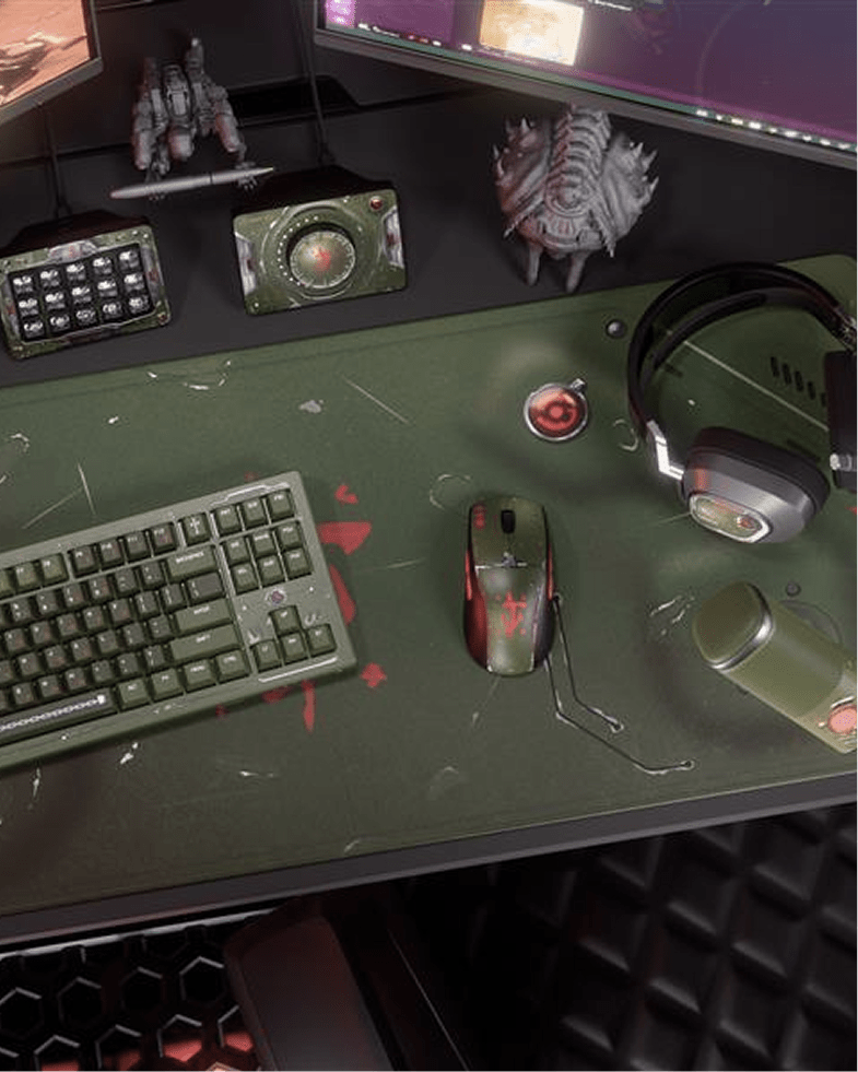
DOOM: THE DARK AGES
In a medieval war against Hell, you need to come prepared. In this exclusive DOOM™: The Dark Ages hardware collection, we've got your whole gaming arsenal covered.
Learn more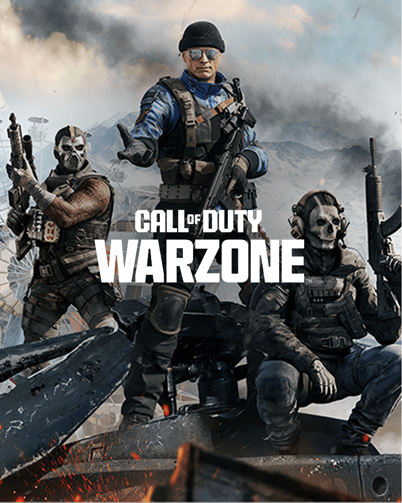
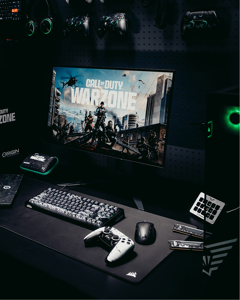
CALL OF DUTY™: WARZONE
Be ready for any second chance in the Gulag. Dominate the fight ahead with the new Call of Duty™: Warzone collection. Show them you're not done yet.
Learn more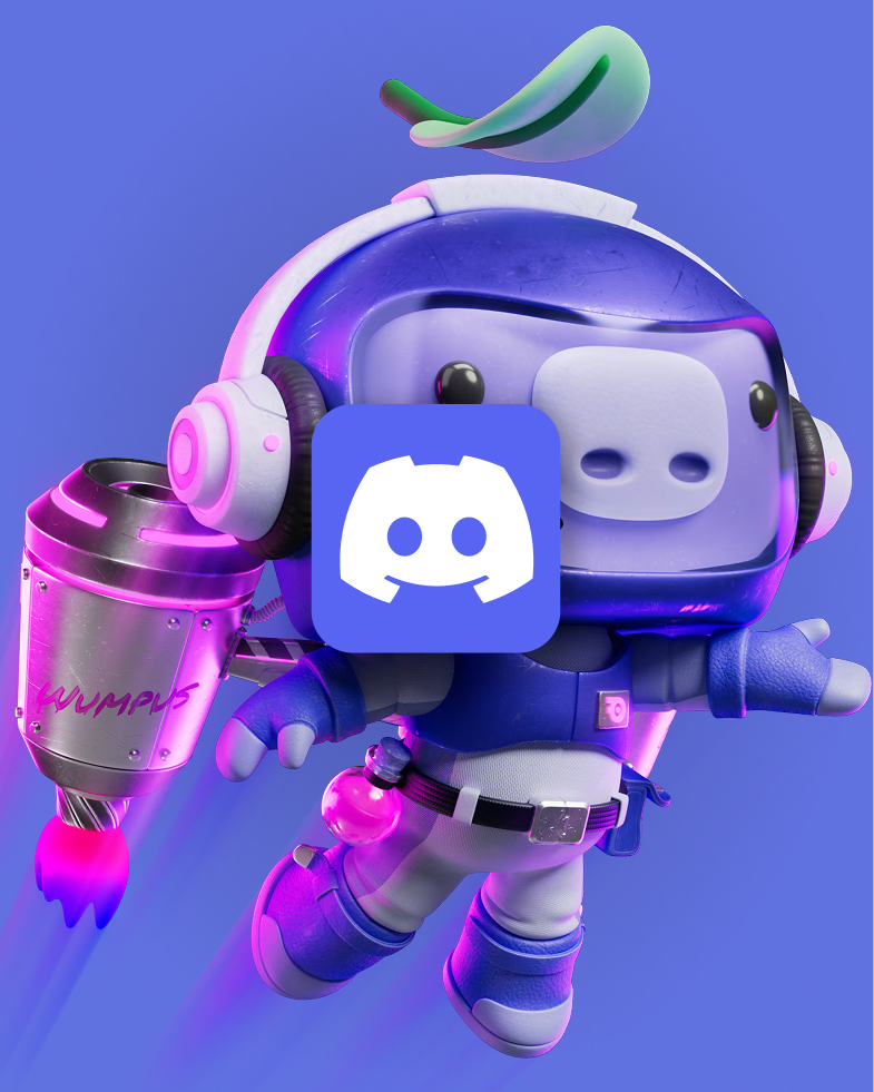
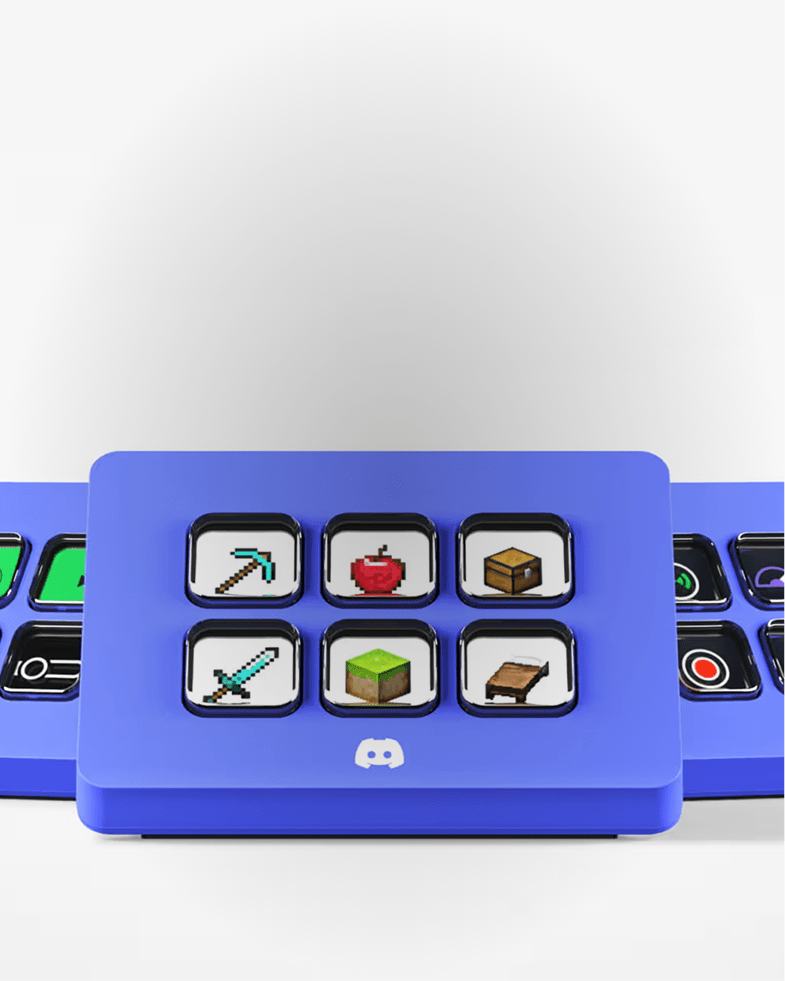
DISCORD
Keep the fun and games flowing with this special-edition Stream Deck, while supplies last.
Learn more on Elgato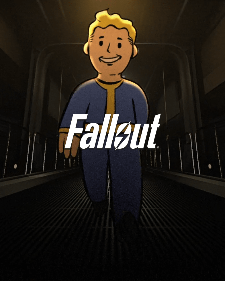
Backed by CORSAIR’s family of industry-leading brands including Elgato, SCUF Gaming, ORIGIN PC, Drop, and more, each collaboration reflects a shared commitment to innovation, craftsmanship, and high-performance experiences for gamers, creators, and enthusiasts alike — available only while they last.