Click to view our Accessibility Statement or contact us with accessibility-related questions


Showing 1 of 55 conversations about:

madebyLisaDean
6
Aug 1, 2016
bookmark_border
I agree the charcoal would have been a perfect frame. After that the silver grey would be great.

Norma
3
Aug 1, 2016
bookmark_border
HeatherVIf the charcoal is no longer available I would go with the darkest blue. I love the look of stripped bindings but this quilt is asking for a simpler approach. So my first choice would be the solid blue that is in your quilt top. Second choice would be another charcoal that is not in the top. But I would use a solid charcoal, not a print or stripe. Your top is beautiful. Don't let a busy binding take away from it.
Related Posts

aryomario
how can i get partnered?
Quick question I'm a tech toker does anyone know how I can get partnered by drop?
Mar 19, 2021

ggctech
Hey drop can you check out my tiktok it is ggctech i review stuff i was wondering if you can send something over that i can review or maybe follow i would love reviewing your products sounds interesting.
Thanks
Mar 18, 2021

jottoh12
What has happened to MassDrop?
I have been gone about two years and return to find a completely a different shopping experience. Even though Spring is upon us...I can count ALL the outdoor items on less than my 10 fingers. Is this the norm now from Drop? Thanks
Mar 16, 2021

TheRealGYK
Watching for watches
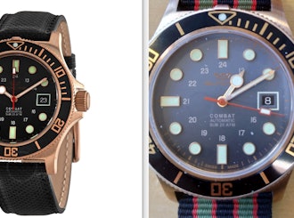
Where have all the watches gone? There are only 6 for sale (at the time of writing).
Mar 10, 2021
Lepiero
X-mid 1p tent available for France
Hello, my question is very simple: when will the Dan Durston X-mid 1p tent be available for France? I know this must have already been discussed and I know I can order it via Amazon.com but it is not the easiest (and cheapest) way to get it. Please, make it available! Don't let me beg you! ;-) Hope to hear from you soon with good news. Pierre
Mar 9, 2021
LarsAF
I bought a Glycine GL0187 and got it about a week ago.
The dial in the picture of the Glycine GL0187 on drop.com is black. The dial on the one i received looks 2/3 faded greyish and the bottom more black. I know it's not, but the dial has the water damaged look. It's not nice and pretty anoying. Any comments?
Mar 8, 2021
Trending Posts in More Community Picks

Graham88
Completely surprised by the lack of blade diversity here on Drop...
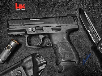
I’ve been a collector of Blades since before my teens, and a retailer coming up on 15… or maybe 20 years. Drop has really been kind of an interesting experience for me, because I do occasionally get to see some unusual tech and sometimes EDC items that otherwise I might not have been aware of. And maybe it’s because I have a deep love of cutlery and bladed weapons, but I find myself trolling through the site looking at it what’s available; and it’s just it’s pretty much the same. And the bladed community here is just always confused me.. every single knife is about the same, they’re almost all drop points and although the handle materials change and brands change.. it’s really just the same knife over and over and over again... occasionally you’ll see a tanto or a slight variant; but rarely… and almost never a serrated blade. And I’m just deeply amazed at this diversion of serrated blades. And I’m just surprised there isn’t more of a request for diversity here.... and I...
Mar 12, 2020
JellyDPhoto
Can we get Sony E-Mount or other mirrorless camera options please..
Would be nice to see some Sony E mount full frame cameras on here. I currently shoot with a A99 and they killed the lense path for better or more option lenses and now is all E-Mount. 🤔
Jan 13, 2020
RayF
There Are Pandas, and Then There Are Pandas.
And this isn't either of them! The Pandas we're talking about here, are watches, not bears. And what got me thinking about them (again) was a link posted this morning by @cm.rook who pointed a few of us to the very attractive (and not terribly priced) Yema "Rallygraph" Panda which, in it's most traditional arrangement, looks like the one on the left, but can also be had in the version on the right: The model on the left is a true Panda, while the model on the right is called a reverse Panda. The reason for that distinction is clear--Panda bears, only come in the first arrangement. Now at this point, everyone should be thinking about the most well-know Panda, The Rolex Panda, which is actually a Daytona, and among Rolex Daytonas, the most famous of which is the Paul Newman Daytona, which was famous first, because it was Paul's, and second because it sold at auction for $17.8 million (US Dollars). The story of that auction is well-known so I'll only...
Nov 8, 2019


