Click to view our Accessibility Statement or contact us with accessibility-related questions$35$35


Drop + Atoms to Astronauts Desk Mats
$29
Drop + Atoms to Astronauts Desk Mats
bookmark_border
$29
Ready to Ship
·
Free Returns in USA
●
Members who purchase earn
87
Drop Rewards
Frequently bought together:

search
close
Sort by: Newest
keyboard_arrow_down
Ed3291
63
Mar 17, 2023
Dang, this would be an awesome gift. But the branding makes it an instant no buy.
Thockologist
1
Feb 7, 2023
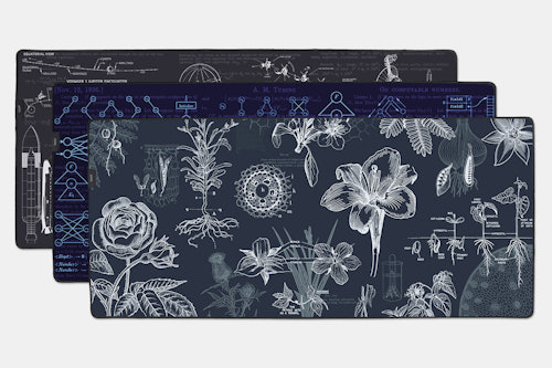
While I appreciate the removal of the Atoms to Astronauts branding, the stitched on Drop logo still ruins it for me. I get it. You gotta self promote and perpetuate the brand and all that, but for the love of design and all that is holy, could both parties just throw their branding on the back and let the design speak for itself going forward? At least move the Drop tag down 2 or 3 inches on the Botany mat so it's not cutting through the design.
(Edited)
Sphex
28
Feb 14, 2023
ThockologistI agree.
My suggestion is that Drop should copy the logo placement they did with the Drop+Marvel desk mats.

SusanA
309
Buying Manager
Feb 2, 2023
Hey everyone!
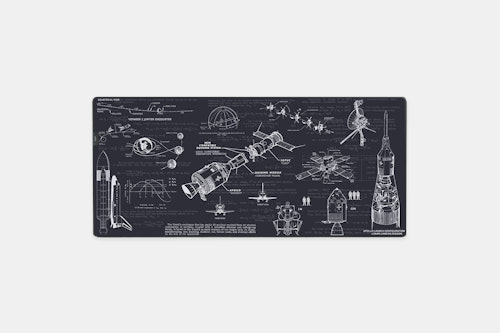
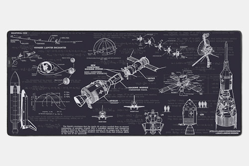
As Damian has stated, we listened to your comments and have removed the branding. The designs will run to the bottom left corner as now shown on the updated images.
Thank you for the feedback!

chancellors
6
Jan 28, 2023
I notice the product pictures have been edited to remove the branding in the bottom left corner. Does that mean the design has been edited to remove the branding for the final desk mats?

briantl
7
Jan 29, 2023
Will the original design run to the bottom left edges now that the branding was removed?
Damolux
44
Atoms to Astronauts
Jan 29, 2023
briantlYes. For Space the rocket has been enlarged and moved slightly, the Computer Science has had something similar done and the Botany rose has been filled in. They look better. Updated images are being done now and will be uploaded asap.
Damolux
44
Atoms to Astronauts
Jan 23, 2023
Hey all, I'm Damian the founder at Atoms to Astronauts. It's great to showcase our work to your community and thanks to all who have purchased already. If you've any questions fire them below.
mensrea
11
Feb 3, 2023
Good to hear sales are strong across the board. Would like to see more of these here! A2A products are super interesting for colleagues at tech companies, I think. Do you do bulk orders (say, 20+) for your products?
Damolux
44
Atoms to Astronauts
Feb 3, 2023
mensreaOur notebooks? Or the deskmats? If the notebooks, yes if you want to email me on damian@atomstoastronauts.com we can chat. The deskmats, I could ask. Thats a drop decision.
mensrea
11
Feb 3, 2023
Not an improvement in my view. Perhaps could have made the A2A branding a bit smaller, but the branding is the point of purchasing a collaboration kit. If I wanted something with no logo or branding, I would buy a no name brand from Aliexpress. A few people have expressed disappointment, but I suspect you may only be addressing the squeaky wheel.
(Edited)
Recent Activity


