Click to view our Accessibility Statement or contact us with accessibility-related questions97% would recommend to a friend 


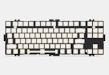
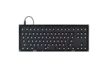
Drop CSTM80 Decorative Case
$25
Drop CSTM80 Decorative Case
bookmark_border
$25
Ready to Ship
·
Free Returns in USA
●
Members who purchase earn
75
Drop Rewards
Frequently bought together:
Customer Reviews
4.6
(35 reviews)
5star(26)
4star(6)
3star(2)
2star(1)
1star(0)
search
close
Images
keyboard_arrow_downSort by: Newest
keyboard_arrow_downGoobest
21
Keyboard Club Member
Sep 26, 2024
checkVerified Buyer
Laser Purple is borderline Blue/Purple
Can't call it blurple because it doesn't look like the blurple that's out there. The Purple stands out if the contrast of the keycaps is subtle. Otherwise, it looks like a bluish shade of purple. Cover is just plastic and does it's job so nothing to write home about.
Recommends this product? Yes
DCtact27
0
Sep 21, 2024
checkVerified Buyer
Love the customization
So I figured if i only had a few boards, there would be less need for caps, then you do this to me...I'm not mad, just broke...love the options though...white...green so far and obviously have the pink on deck.
Recommends this product? Yes

goldsy
110
Keyboard Club Member
Aug 28, 2024
checkVerified Buyer
White is a little too white
The quality seems just fine and it fits ok, but the white one is very bright white and doesn't really go with the white keycaps on many sets like solarized. They need to offer (and frankly I can't believe that they don't already) cases in cream/off white and also beige for retro sets. I don't even care if the case exactly matches a color in the keycaps as long as it is in the same ballpark and doesn't clash with them.
The white color looks to me looks a bit cheap. The smooth texture of the plastic on the CSTM 80 cases is working against this one. You just can't see the texture and therefore it just doesn't look right. The green one is a bit darker than I expected. It works ok with the shinai green keycaps, but consider it a dark compliment to the color scheme. It doesn't even remotely match it.
I'm going to keep the white one. I think it will look better with an appropriate keycap set. I just don't have one that will work with it at the moment.
Recommends this product? Yes
GodsCookie
0
Aug 13, 2024
checkVerified Buyer
Pretty good.
The cases are pretty convenient and good looking. The white one is perfect, however, the green one is more grey than I'd hoped compared to other "shinai green" products on DROP.

Recommends this product? Yes

clock75
10
Aug 4, 2024
checkVerified Buyer
The magnetic force
The magnetic force to attach the case is a bit weak.Recommends this product? Yes
mikecousins
51
Aug 3, 2024
checkVerified Buyer
Nice finish
Nice and silky plastic finish.
Recommends this product? Yes

BlackPoodle
10
Jul 21, 2024
checkVerified Buyer
cstm80 case
black is better than whiteRecommends this product? Yes
stillthatguyjake
4
Jul 17, 2024
checkVerified Buyer
The Perfect Subtle Green!
This was the first and only solid top cover I've purchased and it is even better in person! The shinai 


Recommends this product? Yes

thefancyfish
15
Keyboard Club Member
Jun 27, 2024
checkVerified Buyer
A novel idea that mostly works
A good idea that allows you to easily swap aesthetics without having to buy a whole new keyboard.
Recommends this product? Yes

alejobitco
4
Keyboard Club Member
Jun 1, 2024
checkVerified Buyer
GMK Laser perfect match
Nothing to add
Recommends this product? Yes
Showing 10 of 38
Recent Activity


