Click to view our Accessibility Statement or contact us with accessibility-related questions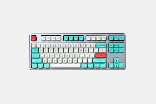
98% would recommend to a friend 


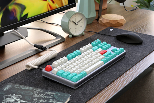
Drop + Matt3o /dev/tty MT3 Custom Keycap Set R3
$105
01 / 29
Drop + Matt3o /dev/tty MT3 Custom Keycap Set R3
bookmark_border
$105
Ready to Ship
·
Free Returns in USA
●
Members who purchase earn
315
Drop Rewards
Frequently bought together:

Review Highlights:
expand_less


Q&A Highlights:
expand_less


Customer Reviews
4.8
(614 reviews)
5star(497)
4star(93)
3star(17)
2star(4)
1star(3)
search
close
Images
keyboard_arrow_downSort by: Newest
keyboard_arrow_downNeilSJLee
1
May 4, 2024
checkVerified Buyer
My favorite set
My fondness for the original /dev/tty set was so great that I also had to get the bleached version.
Recommends this product? Yes
Nehrujanx
0
Apr 27, 2024
checkVerified Buyer
Perfect for work
Very appropriate color schema for work.
Have been using this over a year, still feels lIke new. No shine ate all.
Absolutely loving this.
Recommends this product? Yes
timeToy
22
Apr 3, 2024
checkVerified Buyer
Old school class!
This set DROP + MATT3O /DEV/TTY 
Recommends this product? Yes
eapdang
576
Keyboard Club Member
Mar 27, 2024
checkVerified Buyer
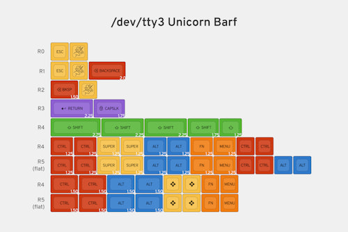
Great kits with both R4 and R5 spacebars
Classic colourway, 3 sizes 6-6.25-7u in both R4 (angled) and R5 (flat) profile
Recommends this product? Yes
MSiegmund
16
Mar 26, 2024
checkVerified Buyer
Small Spacebar set is super useful
I only picked up the small spacebar set to make other sets work for both my split 65% board and my split ortholinear board. Fot $15, the set gives a lot of value by having both row 4 and row 5 AND by having two 1u spacebars for each row. Too many sets these days only have one 1u spacebar
Recommends this product? Yes
Lovelordz
0
Keyboard Club Member
Mar 22, 2024
checkVerified Buyer
DROP + MATT3O /DEV/TTY MT3 CUSTOM KEYCAP SET R3
DROP + MATT3O /DEV/TTY MT3 CUSTOM KEYCAP SET R3
Recommends this product? Yes
mw2en
0
Keyboard Club Member
Mar 4, 2024
checkVerified Buyer
Excellent keycap set
Well made, but prefer dcx better
Recommends this product? Yes
Krika99
13
Feb 12, 2024
checkVerified Buyer
OG MT3 Caps
What can I say, these are what started it all, in PBT as they should be. If you like high profile, this should be considered.
Recommends this product? Yes
TekGadgt
10
Jan 9, 2024
checkVerified Buyer
MT3 is fantastic, Simple/Clean caps.
These feel great to type on. Got them at the same time as the Cyber MT3 set, and these somehow feel better. Liked them enough that I got an ortho set for my Preonic and a full set for my CTRL.
Recommends this product? Yes
rtort
1
Dec 31, 2023
checkVerified Buyer
Comfy profile, darker colours than shown in product pictures
Pros:


- Thick PBT keycaps with little to no warping on walls.
- Well-centred, die-sublimated legends (I guess I was lucky with my set).
- Ortho kit includes convex 1.5u and 1u space bars, which is a good fit for small split keyboards.
- Too dark colours compared to the ones shown in product shots. White keycaps are light grey, while green and red ones are not as vibrant. This gets worse under a light source with poor CRI. See the reference photo comparing a key from this set against a BOW MT3 one.
Recommends this product? Yes
Showing 10 of 663
Recent Activity


Drop Refurbished
Like-new products you can trustDrop Rewards
Get $5 for every 500 points you earn! Learn more
Drop Keyboard Club
Become a member and expand your keycap collectionCollaborate With Us
For Brands & DesignersFollow Drop