Click to view our Accessibility Statement or contact us with accessibility-related questions


PRODUCTS YOU MAY LIKE


Trending Posts in Mechanical Keyboards

kali.shadowOps
TKD Cycle 7 with MT3 EXTENDED 2048 CUSTOM KEYCAP
I am finally done with my cycle 7 . Switches: KDBFansRoller, Linear 60g, and Kailh Chimp Linear GaimingV2 60g. but I will replace the Kailh with Gazzew U4T V2.
May 3, 2024
NewmanDA9901
LOTR Keyboard with Hardcore keycaps?
Hello. Is there a way to get the DROP + THE LORD OF THE RINGS™ BLACK SPEECH KEYBOARD with only the HARDCORE BASE KIT keys? Without the English letters on it. I really want one but it would be awesome if it came with the hardcore kit installed. Thanks in advance!
May 2, 2024


mabyen
Battlestations
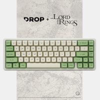
Black Speech keyboard
Looks and feels good and mechanical sound is great!
May 1, 2024

dovenyi
What is SpaceFN and why you should give it a try
The SpaceFN concept - setting up your space key as a layer switch when held - is probably one of the most useful tweaks in the keyboard hobby. Let me explain how it works. My SpaceFN article on kbd.news made some rounds recently - quite surprisingly given the age of this concept. This piece you're reading is a condensed version of the full post. If you're left with unanswered questions, you'll most likely find the info you're looking for in the original write-up. On my imaginary top list of the most useful keyboard features, tweaks and hacks, SpaceFN would deserve a podium finish for sure. But what makes it so special? In short: SpaceFN is easy to implement, easy to learn, costs nothing, can be used with any keyboard, and can improve your productivity instantly. I will list its benefits below, but can state right at this point that the SpaceFN concept, setting up your space key as a layer switch when held, is clearly one of the most useful tweaks in the keyboard hobby....
Apr 30, 2024
Ike4948
Silent Holy Panda X?
I ordered some Holy Panda X switches, and I fell in love with them. They are a joy to type on. There's just one problem. The place that I use my keyboard to type the most is obviously at work, which is a problem if I want to use the Holy Panda X in the office around a whole bunch of people. I really don't want to torture my coworkers with the clack of these switches. I'd rather they still liked me. The good news is that, for me, the actuation of the Holy Panda X is the best part. I could take or leave the sound it makes; even if it is fantastic. Which leads me to my conundrum: is there another "silent" switch that feels similar to the Holy Panda X? Is there a piece I can remove from the Holy Panda X that would allow me to make them silent? Or am I going to have to wait and see if Drop will drop a Silent Holy Panda X for the in-office mech community?
Apr 29, 2024


Drop Refurbished
Like-new products you can trustDrop Rewards
Get $5 for every 500 points you earn! Learn more
Drop Keyboard Club
Become a member and expand your keycap collectionCollaborate With Us
For Brands & DesignersFollow Drop
Overall, the look of the set is quite pleasing, and I may be coerced into buying some of it if the price is right, but I feel that it shines badly on the community when some of the half-thought out ideas in this set are meant to represent a finished product.
https://mitormk.wordpress.com/
> F-row upper case:
It's an AEK influence which I wanted to implement. Lower case f didn't look very good when immediately paired with numbers.
> Center/Top Left alignment:
Text is top left and icons are center, simple as that. The icons modifiers were designed specifically for the runic kit and this keyset is not supposed to be a mix and match between icons/text. My 2D mockups are mix and match for the sake of advertisement of the kits, but you can see that no 3D renders have icons in them. I created some "rules" that I didn't share, people were not supposed to mix icons/text like some of you are figuring out. It was a mistake from my part and bad advertisement by displaying icons/text mixed together on my mockups. You either go full text or you go runic + icons, unless you have a numpad - in which case you'll be forced to use some icons. Does that make sense?
BUT!
Here's the thing - We are still in the feedback phase and I believe we can turn things around.
There's only one way to bring our vision to reality - and it is by offering a very important kit that should have been included to begin with.
Update coming in the next minutes.
Feedback is extremely valuable and most of your post above was well composed and I do agree with parts of what was said, I just don't think you should encourage pigeonholing when this is meant to be a Canvas. I don't know why there'd be a need to be dealing in absolutes here.