Click to view our Accessibility Statement or contact us with accessibility-related questions
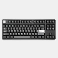
Hey everyone, Wanted to chime in and address some of the things brought up in discussion here. Also wanted to post some of the pictures that I had promised earlier. Magnetic Feet One of the first things that I saw posted a lot about are concerns with the magnetic feet. Some who have tried our feet on the CTRL and ALT keyboards have had misgivings about their implementation. We definitely heard the feedback and have made improvements for the SHIFT. This includes doubling the number of magnets per foot along with stronger magnets overall. TaeKeyboards touched on this a bit in his review video. I also have gif below of me pushing the SHIFT around on a deskmat.
search


Spacing Another piece of feedback I’ve been seeing is in regards to the gap between the Alphas and the Function row. There were concerns about how reachable the function keys would be given the increased space. This is a valid concern, and I think the photos on the page seem to make the gap look larger than it actually is. To hopefully put some concern to rest, here are a few photos below, showing Function shortcuts being used on the SHIFT. Note that these images use different keycaps than what will come with the SHIFT.
search

search
For you DOTA and other MOBA players, here is how it would look when you need to access your Function keys while leaving your left hand on the default QWER ability hotkeys.
search
Here are some additional photo of the SHIFT in the wild.
search


search

search

search


Layout I’ve been seeing many posts from people who are advocating for a more compact 1800 layout. The one that I’ve seen gain the most traction from is the removal of row 2 from the numpad cluster and pulling in the Function row with the main cluster to better mirror the space on the CTRL keyboard. We are definitely open to dialogue on this change, but I’d love to hear everyone’s thoughts - especially those who have already joined this pre-order and have now seen these additional images in the post. What are your thoughts on variations of the 1800 layout - what is the most preferred approach here? As always, I appreciate the passion from everyone and can’t wait to hear about everyone’s thoughts!
(Edited)
AstrologerPrime
31
May 10, 2019
YanboWuThankyou so much for this reply and update. I would 100% be a fan of the compact 1800, you would have a much more ergonomic and reachable keyboard. Even after seeing these images I think the spacing between the Function row and the Number row is too high. Compact 1800 and Compact High Profile 1800 is definitely the way to go!
pichetc
12
May 10, 2019
YanboWuThanks for your attentiveness. I have to admit that I placed the order almost instantly without looking and found out later that the gap really concerns me. Like the others have said, the low profile will fit beautifully with compact 1800 (https://drop.com/buy/drop-shift-mechanical-keyboard/talk/2419105) In term of functionality, with denser top row like TX-CP (https://imgur.com/r/mechanicalkeyboards/bk7Ez), we will have just 3 keys less than the full 1800 layout with more aesthetic and compactness.
TankedThomas
10
May 11, 2019
YanboWuMore compact would be way better, but then again, I'd prefer a true 104-/108-key full-size board because I use all the keys. Either way, I hate the current design, and that gap is still way too big. I'd rather a wider keyboard than a taller one.
(Edited)
joshuakal
120
May 11, 2019
YanboWuAlso want to echo a thank you for replying and updating! I would definitely prefer a more compact layout, would also be in favor of a traditional full-size layout. I’m just thankful you guys created a variant with a numpad!!
KGZR
55
May 11, 2019
YanboWuthank you for more photos and an update. I am currently considering buying this keyboard and main stoppages for a pre-order are 1) huge gap between function row and numbers row; 2) overloaded right part. I would really appreciate «clearer» looking keyboard without too many keys or strange huge gaps without clear reason (please take Ctrl as a reference) . Standard full size (104/108 keys) will be ok too. Nevertheless, current look is really strange: top row with a big gap and the right side is overloaded
(Edited)
KM1337
1881
May 12, 2019
YanboWuI personally enjoy the large pillar of keys that makes up the right side of the board. My vote would be to add a second layer of function keys to fill the gap, instead of taking away from numpad cluster. More keys + same space/form factor = better.
KM1337
1881
May 12, 2019
YanboWuSeriously, just get rid of the 4 key clusters for the F-keys, make them on continuous row all the way to backspace and then just slap another row of function keys under those. The more Laser I can put on it the better. Also, thanks for posting with all the other keycaps / profiles on the board! Laser looks great on it and I can't wait to fill it out with my own. None of those sets look bad on this board either, even the SA Danger Zone set looks really sharp on it, even for a float-key case.
(Edited)
mullinz
33
May 13, 2019
YanboWuI'd purchase if the layout changes were made in regards to the removal of the row 2 from the numpad area. It doesn't look quite right, and I think the aesthetic would vastly improve with the change. My other complaint is why are there no color options up front? The ALT, CTRL variants all have had color options at this point. So it's frustrating as a consumer where we are paying well in advance, to have no choice in color. I'd prefer to get the choice of color in this drop, rather than have to wait for some secondary "limited" drop just to have a choice in color. The pattern thus far is to a month or two later release a color option, for a product that hasn't even delivered it's first round yet, which seems unfair to the consumers paying well in advance to support a new product. Last I do believe this case would look better in hi-profile, and some transparency on when that might come to fruition would be nice.
holzhead
28
May 13, 2019
YanboWuIs there any chance you will ever release a full sized keyboard in this series, but with a standardised layout? I dont mind it being long and clunky, but I dont want to give up the other amazing features of this keyboard
YanboWuHey as a backer my concern is still the space between the function keys and the number row because I have smaller hands I believe I will have to leave WASD space to reach the function keys. Also I understand the chaos of the right side to be able to include all the keys, but it does seem many people my self included prefer the Leopold 1800 layout to be more compact while sacrificing the home, print, and pause keys. These keys tend to be pretty useless to 99% of users so I would definitely be okay with sacrificing them for a more compact package. This would be able to remove a whole row and bring the functions keys down with it to create a more aesthetically pleasing layout and more compactness.
Skizosavior
17
May 13, 2019
YanboWuI have been waiting for the 1800 version of this series of boards since getting the K-Type that led to the Ctrl/Alt/Shift. When I initially saw the drop I thought I finally had my dream board, but after considering it more and more, I've held off on this drop because of the huge gap. I understand that it is the classic G80-1800 layout, but the board would be functionally easier to use by just dropping the 2nd row of the nav cluster and moving everything down. The easy customizibility of key funtions means you don't even lose the ability of those eliminated nav keys if so desired. Bring on the Compact!
holzheadI agree, seeing a full sized keyboard in this series would be great.
GarrettW
21
May 15, 2019
YanboWuI'd definitely prefer removing row 2 from the numpad cluster - in a low-profile design the gap up top feels awkward compared to the gaps for arrows/numpad. Personally, I'm looking for a board to show off the full R0-R5 profile from the latest Carbon drop, so I'd love to see a six-row compact design.
justspeechless
0
May 15, 2019
YanboWuA 96 compact layout with f keys over the num row beats 1800 imo. Please show how awkward it will be to press shift + f4 or ctrl + f4 for the games i play...
(Edited)
PrometheusG
9
May 15, 2019
YanboWuFull size layout, please! I have zero interest in compactness. After 40+ years of typing on a regular full size keyboard, I don't want to have to learn a different layout just because keyboard enthusiasts think smaller == better. It's a big turn off and makes me lose interest to constantly only see tiny boards. I thought, "Finally!" when I saw this one. Then realized it's just another variation of enthusiasts trying to make things compact and difficult to use for the average person. Now you listened to the feedback, and your response is to try to make it even MORE compact!?!? F this crap.
KM1337
1881
May 15, 2019
YanboWuThere's a lot of outcry for a 104... I feel like the market is already pretty well saturated with 104's. If drop does a 104, I hope it's not the shift. I like the 1800 layout and would likely retract my order if it goes 104, as I could pick up something comparable already, for probably less. I honestly would rather the board stay the way it is or move the F row down with macro keys above them, if they have to be moved. I'd rather pay for more buttons and features than pay for less.
YanboWuCan you please add an extra row below the F-Row. I’ll have use for macros and at the same time I’ll be able to utilize both SA Laser’s Turbo kits and Mitowaves. Most useful keyboard with macro keys and a place to put novelties and artisan keys.
AstrologerPrime
31
May 16, 2019
PrometheusGI disagree. 1800 Compact is pretty much identical to a Full Size layout. Most people don't use the features on a full size keyboard. It takes about an hour to get fully used to using a function layer if you *really* need to. I've given my 60% keyboard to my 50 year old mum and she has literally no complaints using it. Massdrop has been and will always be a community for enthusiasts. If you're looking for generic full sized keyboards I'm sure your nearest department store can help you with that.
kidshowbiz
4
May 16, 2019
YanboWuPlease do a 104/108 key board, preferably with a black plate option.
LinebackerU
65
May 17, 2019
YanboWuI've already pre-ordered, but I would be a huge fan of the 1800 Compact layout you describe. The aesthetics of the huge gap are my biggest hesitation about this. For what it's worth, I would cancel my pre-order if the layout was changed to a conventional full-size keyboard. There are thousands of those already available.
KGZR
55
May 17, 2019
YanboWuHi again, reading all comments above I come to conclusion that people either interested in “more compact” layout (without strange gap, even if it would lead to decrease of keys by 4) or in standard 104/108 layout; nevertheless current look is not so popular (considering the amount of pre-orders it is more or less obvious) That is why I kindly ask you to tell what decision from Drop we should expect, ideal situation is to get reply on a community feedback before ending of a pre-order period to react accordingly. Thank you in advance p.s. As for me both options described above are working as far as numpad remains and external looks became more “clear”
BurnsAllot
32
May 17, 2019
YanboWuIMO, y'all should go for the KBD19X with a smaller gap between the F-row and num-row, like the small gap between the arrows between alphas and numpad. As if a KBD19X and TX-CP had a child. IMO the compact F-row makes the board too claustrophobic. The "small gaps" would be truly unique to Drop, as KBD19X and Leopold FC980 is more or less a normal gap, and the no gap is distinctly Korean CPs (TX, LZ, etc.).
(Edited)
BurnsAllot
32
May 17, 2019
PrometheusGJust because a compact doesn't appeal to you, doesn't mean you should try to just have them scrap the whole idea. I find full size and 60% keebs useless, but I'm not going to champion the idea of NOT doing it.
(Edited)
YanboWuFor sure move to a compact 1800, the whole board would have a more sleek and usable layout.
m0ro
132
May 19, 2019
YanboWu
search
Maybe something like that? I'd rather not have arrow separation there to save some gap space. It gives it a different look but it's got a bit of charm to it. I got crazy excited when I saw this drop but that gap is keeping me from buying in. Honestly, I still might even with the gap but it just feels like a compromise. I would probably take a 96 key layout over the gap.
(Edited)
rtam90
6
May 20, 2019
YanboWuI would want to see a 96 layout.
vyang
10
May 20, 2019
YanboWuI suggest we present the few layout that was brought up here in this thread and do a poll. Personally I urge you to take the design of boolean-julien, who has currently 53 upvotes: https://drop.com/buy/drop-shift-mechanical-keyboard/talk/2419105?utm_source=linkshare&referer=4L6THS
KM1337
1881
May 20, 2019
YanboWuIf it helps, y'all can just charge me now and send me the working prototype in the current layout, since no one else wants it xD
fderbs
33
May 21, 2019
PrometheusGOh shush old man
PRODUCTS YOU MAY LIKE
Trending Posts in Mechanical Keyboards