Click to view our Accessibility Statement or contact us with accessibility-related questions


Showing 1 of 1481 conversations about:

karpador
96
Oct 17, 2017
bookmark_border
WhiteVaille
33
Oct 17, 2017
bookmark_border
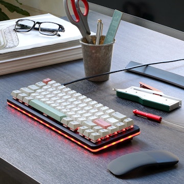
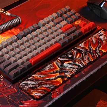
karpadorShit. If this is what the actual caps look like, I think I'd rather get my money back. I was thinking they would be more muted, less saturated. While I enjoy custard-filled donuts, it's not a color I want for a set of key caps. Bleh...
Also a bit of a shame that the typeface couldn't be as thin as it is in the renders.
Thanks for the pics!
Also a bit of a shame that the typeface couldn't be as thin as it is in the renders.
Thanks for the pics!
douglasryanadams
49
Oct 17, 2017
bookmark_border
WhiteVailleThis doesn't look anything like the color tones in the images of the description. @karpador does it look like what you expected based on the renders in the description? I was hoping for something more grey-scale than that cream color. Thinking maybe you cranked up saturation based on the purple hue of the laptop screen's reflection.
karpador
96
Oct 17, 2017
bookmark_border
douglasryanadams@douglasryanadams @WhiteVaille
To be honest, I have pretty bad eyes so at first I did not realise how colour tones might have been different. After reading your comments, I think the colour might be a little more creamy than how it shows on the description page.
I also have yellowish/dark lighting, so I used my table lamp (which has relatively more white lighting) and took the photos again. This is the photo of the keycaps under direct light.
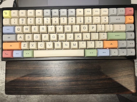
I wanted to put something everyone knows to compare the colours, but I couldn't think of one... so instead I compared with Tai-Hao ABS Carbon keycaps.
Hope this helps.
To be honest, I have pretty bad eyes so at first I did not realise how colour tones might have been different. After reading your comments, I think the colour might be a little more creamy than how it shows on the description page.
I also have yellowish/dark lighting, so I used my table lamp (which has relatively more white lighting) and took the photos again. This is the photo of the keycaps under direct light.
I wanted to put something everyone knows to compare the colours, but I couldn't think of one... so instead I compared with Tai-Hao ABS Carbon keycaps.
Hope this helps.

Raccatography
197
Oct 17, 2017
bookmark_border
karpadorhow does XDA feel compared to the standard cherries on the kbd75? :) Excited to get mine and condolences to your J letter :(

douglasryanadams
49
Oct 17, 2017
bookmark_border
karpadorThat's very helpful! Thank you so much for taking the time to follow up. :)

karpador
96
Oct 17, 2017
bookmark_border
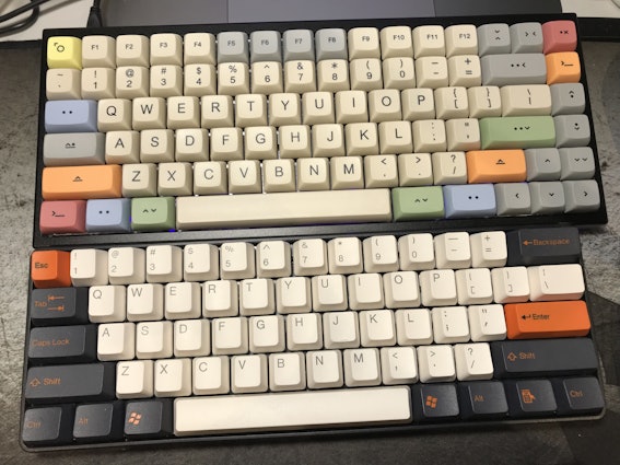
weijuIt was already after sunset when I took the photos, so if you want, I will try taking pictures again with the natural light near the window tomorrow. :-)
karpador
96
Oct 17, 2017
bookmark_border
SakisI just pulled out the spacebar to make things sure, and I can confirm that it is not warped. I guess it is the light :P
karpador
96
Oct 17, 2017
bookmark_border
RaccatographyUmm I this is the first keycaps set I've ever put on kbd75 (yes, it just arrived) and I only typed a few words so I don't think I can fully describe the feelings. However, this is my first XDA profile keycaps and I think typing on uniform profile over all the rows is quite a new experience. It feels kind of weird :p
Raccatography
197
Oct 17, 2017
bookmark_border
karpadorThank you! I am actually longing for the laptop typing experience (all uniform shebang) :D
A community member
Oct 18, 2017
bookmark_border
karpadorGood one mate! Did you tried the XDA profile? May I ask how did it feel compare to DSA or any other equivalents? BTW I start regretting not getting Bauhaus mods set(colour richer than I thought) after seeing your on board demo.
karpador
96
Oct 18, 2017
bookmark_border
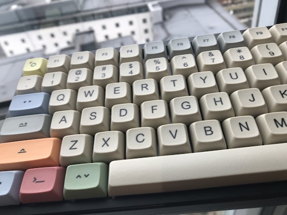
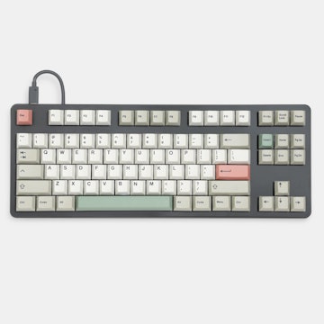
weijuAs @weiju suggested, I took a photo near the window before I left for work today. The colours definitely look different from the photo that I uploaded very first, so I guess it is all about the lighting. Hope things are more clarified for @WhiteVaille and @douglasryanadams as well.
ivan0p0lis
10
Oct 18, 2017
bookmark_border
karpadorDang that is nice. Did you get a notification that it shipped? I hope mine get here soon.

mogranjm
25
Oct 18, 2017
bookmark_border
jc303I reckon it looks like all of the legends are slightly right-aligned. The V, F and J keys more so somehow.

TTheuns
884
Oct 22, 2017
bookmark_border
I can chime in on this. I have a full board on DSA Granite and I recently swapped all the alphas on my TADA68 to blank XDAs to try the profile. XDA is a much more natural feeling profile, hard to explain. It's definitely a better feel than DSA, DSA feels like you're typing on something flat, while XDA has a nice curve to it. An even nicer curve than SA in my opinion. I'm looking forward to more mainstream adoption of the profile.
karpador
96
Oct 30, 2017
bookmark_border
frooddudeMy backspace is 2u indeed. You probably should contact Massdrop support team.. I am sorry for you.
frooddude
0
Oct 30, 2017
bookmark_border
karpadorI have, just wanted to make sure I wasn't missing something as the sizes of the caps weren't explicitly called out in the buy details as far as I recall and can currently see. Thanks for verifying.
Related Products

Drop Refurbished
Like-new products you can trustDrop Rewards
Get $5 for every 500 points you earn! Learn more
Drop Keyboard Club
Become a member and expand your keycap collectionCollaborate With Us
For Brands & DesignersFollow Drop
Hope this helps.