Click to view our Accessibility Statement or contact us with accessibility-related questions


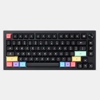
Designing an Apple-inspired keycap set

search
close
Sort by: Newest
keyboard_arrow_downHivehand
28
Jul 26, 2023
How about… [glances furtively left and right before uttering the crazy] how about instead of, or at least in addition to, having Mac-inspired keycaps, you offered Mac-compatible keycaps? Specifically, for starters, Command and Option. It blows my mind that only Keychron seems to provide these out of the box.
alti83
13
Jul 21, 2023
Seriously guys, please try to be a little better with the combinations. If you are a colemak user with a non-common keyboard layout then you have to end up buying almost every option to get all the keys that are needed.
dtolb
50
Jul 21, 2023
Please, please, please make the sets sensical. Include a space bar in the alphas or color-modifiers. Original set was way too $$ to get any semblance of color
michel.v
15
Jul 21, 2023
Dear Drop, did a Colevrak user hurt you?
There is only a grand total of four MT3 sets with Colevrak kits, out of more than twenty MT3 sets.
CONIN
189
Jul 20, 2023
I'd buy this set (or the white one) in a blink of an eye, if it was in either XDA or Cherry profile instead.
biip
261
Verified Vendor
Jul 21, 2023
kartiksathappanKits will be posted soon.
There will be two base kits, both featuring "WoB" keycaps. The accent kit will be separate.
kartiksathappan
96
Aug 19, 2023
biipEnded up getting novelties, accents, and base!
have been waiting for an all-black drop from you, this will be my first foray outside of built in Mac keyboards 😇
(Edited)
etrigan63
44
Jul 20, 2023
Please, please, please include keys for extended Alice layouts (Alice plus 5 macro keys)!
biip
261
Verified Vendor
Jul 21, 2023
etrigan63We've got you covered! The novelties kit should feature more than enough keycaps to cover any macro column/pad.
Bitvar
0
Jul 20, 2023
Are these keycaps a good plastic (not ABS) or a bad structural plastic designed for return customers (ABS, which is soluble by fatty oils like the ones found on human skin)?
Bad__Music
0
Jul 25, 2023
Darn, I guess if you're trying to hit a certain price point then double shot might not be feasible. They looked to only have two colors per cap, so I was really hoping these would be double shot as opposed to the previous white set. Dye sub is the only reason I haven't bought the white set and it will be the only reason I don't buy this set.
PSPSPSP
11
Jul 20, 2023
Oh my science! I've been dreaming of this set in black! I have the base off-white set and love the sculpt, feel, and sound of these caps!
PRODUCTS YOU MAY LIKE


Trending Posts in Mechanical Keyboards

kali.shadowOps
MT3 9009 - CTRL Hight-profile
Drop MT3's are my favorite keycap format. complete my Dark-purple CTRL and my TKD Cycle7 nicely..
May 31, 2024

ThereminGoatMK
Not All Linears Are The Same!
Figure 1: Not even all of these (mostly) KTT-made linears are the same! After all of my years of collecting, reviewing, and obsessing over switches, I can say with certainty that linear switches are the most misunderstood of all of the switch types. No, I’m not talking about mechanically either, as all of the claims of them “just going straight up and down” are somewhat kind of true. (Not too much though, don’t get that excited.) The part that is often misunderstood, though, is usually in what is being implied when people say that these switches just go straight up and down – “All linears might as well be the same.” If the title of this article didn’t make that obvious enough to you, I find that sort of idea to be completely and utterly wrong. The people who make these implications wouldn’t say that a Cherry MX Black is the same as a Novelkeys Cream switch? They also certainly wouldn’t ever claim that every Gateron-made linear is the same as every fancy TTC one out there...
May 29, 2024

Ike4948
Have you noticed the flaw in the Shift V2 case?
I recently decided to try adding screw-in stabs to my Shift V2. As this was my first time adding screw-ins, it took me about 45 minutes to get them on the PCB. The next hour was then spent unsuccessfully trying to get the PCB to sit nicely in the top of the case. I started unscrewing some of the stabs, trying to figure out which one was the problem. I did also manage to figure out that it's best practice to have the screws a little loose when you go to pop the PCB in the case. But that only worked for four of the five stabs. The fifth stab, the Num Enter stab, would sit properly. Once I got it narrowed down to that stab, I started looking at the case itself. That's when I found the problem. There is a little post that interferes with the screw-in stab's screw (pictures included; you can see the damage from the screw being mashed into the post). I assume this is a carryover from the V1 case, for which the included PCB did not have holes for board mounted stabs. So now the questions:...
May 26, 2024

DarthChalupa
Nice keys, my phone camera sucks.
The black makes the shine-thru really pop, and I find goes well with most light colors. Unfortunately you'll have to take my word for it, because my camera has crap light settings I can't change.
May 26, 2024

miles.chatterji
Favorite Artisans
SA Carbon Drop + T0mb3ry
SA Carbon Drop + T0mb3ry on Tokyo60 in Coyote.
May 24, 2024
StormyTheCat
Recommendation needed for better locator (F & J) keys for Cherry MX OEM Profile keyboard
I keep losing the location of keys on new DAS 4 Pro Keyboard. i.e. My hands can't tell if they have shifted left or right a key. The keyboard has Cherry MX Brown OEM profile 104 keys. I'm looking for new keycaps to help my fingers better locate the F & J keys. I've been a touch typist for decades (going back to the IBM Selectric) but have been using MS Ergonomic 4000 keyboards (no longer available) since the 90s. The stretched G & H keys on that keyboard likely contribute to my having some difficulty getting used to a standard layout. I'm looking for either a more pronounced "bump" on the locator keys or I've heard about keys that are more spherical and the F & J keys are a deeper depression (MT3?). I've found that a touch typist position with more vertical fingers completely missing the bump on my DAS keyboard F & J keys. How do the different profiles change the keyboard. i.e. Can I use a few MT3 keys with my OEM keys? I have all black keys now, and am not looking to go...
May 23, 2024

Colorcrow
Battlestations
The Elven Kingdom
My (finally) complete set for my desktop. A map of the Lord of the Rings as a mousepad, some wooden wrist rests, and of course the LotR Elven keyboard along with the keycaps for a numpad.
May 22, 2024
Drop Refurbished
Like-new products you can trustDrop Rewards
Get $5 for every 500 points you earn! Learn more
Drop Keyboard Club
Become a member and expand your keycap collectionCollaborate With Us
For Brands & DesignersFollow Drop
It's clear that the design for Extended 2048 (and Extended 2048 Dark, by extension) is heavily influenced by vintage Apple keyboards like the Apple Extended Keyboard and its derivatives. What is your personal history with these keyboards? Did you use old Apple computers growing up? I've always been drawn to vintage computers, especially microcomputers. They have a strong influence on my work, with an unrivaled charm that is hard to find today. For me, the AEKII is the most refined yet timeless keyboard from that era. It still exudes something contemporary today. Are there any in-progress design documents that you would be comfortable sharing, to give the reader an idea of what the process of designing a keycap set actually looks like? Extended 2048 being the first set I designed, I no longer have any sketches or the first icon files. What did your process for designing Extended 2048 look like? Both philosophically (I'm sure you didn't directly copy any iconography from Apple) as well as logistically. For example, how did you determine optimal line weights and icon sizes to fit well on the spherical MT3 keycaps while still retaining the nod to the original Extended Keyboard (off-center legends)? The idea was to keep the essence of the AEKII set, while making it more modern and compatible. Regarding the typography, I defined a grid based on the keys with the largest characters, i.e. {[ }], so that everything would fit in afterwards. The legends are, obviously, centered vertically to avoid any distortion on the MT3 profile, which is spherical, but also for aesthetic purposes (As well as echoing vintage keycap sets, it makes the captions more legible). Can you explain a little bit about the design choice to use icon modifiers instead of text mods like the original Apple boards? Icons/illustrations will always be more universal than words. They also give character to the set, making it unique. Not all modifier keys need to have an unequivocal legend, linked to their function, nor is the idea to restrict the user to one and only one way of arranging keycaps on their keyboard. The accent modifiers in both 2048 sets incorporate the classic "six colors" from the famous Apple logo. What ultimately led to you using these particular shades in the set? The colors used in the keycaps are a bit more pastel compared to the more saturated colors that Apple used. The colors are indeed inspired by the Apple rainbow logo, but I wanted this addition to make sense, give off a vintage air, and fit with the cream color of the other keycaps. I was worried that garish colors would stand out too much and break the homogeneity of the keycap set. In the years since first designing the Extended 2048 set, have any new novelty icons come to mind that you would like to add to the kit? Probably more functional icons such as: gear, eye, workspace, monitor, any tool from popular software, etc. Fittingly, some of the novelty designs included in your 2048 keycap sets draw heavy inspiration from the original Macintosh icons and logos. Has Susan Kare and the rest of the design team from that era at Apple influenced any of your other designs that we might not have picked up on immediately? Probably; I'm inspired by a lot of things. Actually, I'm careful to make each set different from the next, so you shouldn't find a direct reference to his work in any of my other sets. ____________ Thank you again to biip for taking the time to answer our questions and giving us a little peek inside the design process! Let us know if you’d like to see more designer interviews for future keycap sets.