Click to view our Accessibility Statement or contact us with accessibility-related questions


 0
0
 0
0 0
0


If you want to brand yourself as a more premium company, I'd recommend going with something simple and low-key, as non-obtrusive as possible. It's more about the product than the logo. 00
00


 00
00


About Varmilo's new logo , i need your advice.Which do u like better?
About Varmilo's new logo , i need your advice.Which do u like better?
9
No VARMILO. Just Logo.
574
"Comic Sans did nothing wrong."
113
I like the 1st and the 3rd, that if it just a logo ofr the company or something. However, if it is about the space-bar printing or the keyboards' case embossement , then it should be clean. No logo, no shenanigans.
321
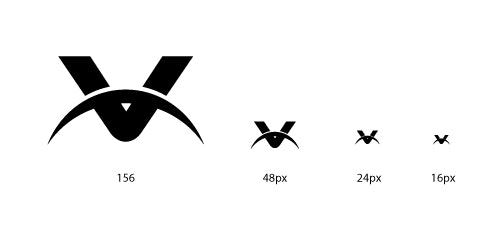
Looks like #2 is in the lead. If you go with this one, I would just recommend adjusting the space below the arch in the V as I think you might end up with scaling problems if you display the logo relatively small. I recreated the "V" and did a quick mock to show you. Just wanted to point this out as I've run into this issue before.

erikbro
Hahaa like this .If we take #2 ,I'll tell the desginer what u said erikbro .Thank u so much to help us make better.
257
erikbro
From a different perspective : if we sum up the votes for the other options (not even including "Comic Sans"), which do not sport any "V" addition, we end up with a greater count. 137 to 119 when I wrote this.

Very good ampp33 and TrevC2 ,thank you for spending time on it :D

CitizenationTW
There's your validation, TrevC2!
A logo-free version of the VA68M will have me sold in an instant. Thanks for listening to the community! When do you plan on selling that version on Massdrop?
Not this drop ,maybe 3 months later ? Sry I can't give you a definite answer .
26
If you want to brand yourself as a more premium company, I'd recommend going with something simple and low-key, as non-obtrusive as possible. It's more about the product than the logo.
My fiancee and her twin are senior designers -- Web and industrial, respectively -- and they're some of the touchiest people I know. I've also designed my own books for publishers and worked with graphic designers on various publications for many years, so perhaps argument by authority doesn't quite work here.
You should visit my world (or my background, at least) of classical competitions, where judges and master classes teach you to "stand always in that hard Sophoclean light and take your wounds from it gladly"! That said, I learned how to offer suggestions without giving people a complex by working with studio musicians for the better part of my life.
So when I observe that a constructive suggestion might be worded unconstructively, I speak from experience, not naiveté. And there's a difference between "dressing up criticism in apologies" and offering a new direction for a project without shooting down previous work.
574
Varholiaglimp
Fair enough! My experience in the design world ended with my architecture degree. I went into engineering where we have right and wrong answers, and criticism is therefore much more straight forward!

I was just about to post this part of what ClassicKay said: Use the V symbol from version #2 alone and drop the spelled-out name. It's particularly important to avoid putting words on the front of a device that's going to be used to convey other people's words. Let them focus on their own words, which a wordless logo will allow them to do. Also: I'd put the logo on the bottom of the keyboard, as you've done with the VB87M. And if your boss won't do that, then I'd consider offering special drops on MD for keyboards without logos. I promise you'd sell far more VA68Ms if you left the logo off the front of the keyboard. Look at the sales for that keyboard versus the VA87MR, which doesn't have the front-printed logo.
Sanstitre: It seems I haven't expressed myself clearly. The reason that I might not be alerted about a second drop is because the version of the keyboard that CitizenationTW mentioned sounds like a MD exclusive; in fact, he said as much. And just as MD-exclusive color schemes for headphones by Beyerdynamic get separate drops, as do different-colored versions of the AKG 7XX, so the VA68M could be offered with various MD prefs (such as the removal of the logo from the aluminum case) as a separate MD edition. Other companies do that for clarity as well as marketing, so that people who participate in a given drop know what they're getting.
It's really up to Varmilo, though, and I would never claim to know or anticipate what they're going to do.
It's really up to Varmilo, though, and I would never claim to know or anticipate what they're going to do.
257
Varholiaglimp
True, I did not think about the separate MD editions.
302
Logo needs to be on the bottom, and logo #1 is much better than logo #2.

Super awesome you guys are taking community input! I think one looks better, but I dislike that its blue instead of black. I think you would be able to sell more of these if you were able to convince your boss to abandon the logo all together on the case or just put it in a very discreet area like on the bottom of the case.
59
No logo. Just put it on the label on the bottom. Anybody who cares will know what this is. Half the point of Varmilo keyboards is the clean, minimalist look. Apple doesn't put a giant Apple logo on their keyboards. People know what it is. You are in a niche market. 99.9% of people don't even know what a mechanical keyboard even is. It's not like Dell putting a logo on their keyboard screaming this is a cheap $10 Dell keyboard -- avoid at all costs. If you put the logo on the case or the spacebar, it just DEVALUES the product. It means extra cost to replace the keycaps or get a different case. It doesn't add value at all IMO. Keep it clean-looking.
Finally,Boss decided to abandon the logo in comic sans .
And two new logo has been designed as you can see in the poll.
No.1 is designed by my friend and I ,and No.2 by the other.
Which do you like better?
Give me your advice.

CitizenationTW
It's great that you guys are willing to listen to the community!
I do think logo 2 looks much more modern compared to logo 1. The IDEAL/BEST scenario for me would be if we HAD to get branding on the case I'd prefer if it was just the "V" symbol in logo 2. We could always have the entire logo on the box and pcb.
I do think logo 2 looks much more modern compared to logo 1. The IDEAL/BEST scenario for me would be if we HAD to get branding on the case I'd prefer if it was just the "V" symbol in logo 2. We could always have the entire logo on the box and pcb.
ClassicKay
You guy put forward a constructive suggestion.
Drop Refurbished
Like-new products you can trustDrop Rewards
Get $5 for every 500 points you earn! Learn more
Drop Keyboard Club
Become a member and expand your keycap collectionFollow Drop