Click to view our Accessibility Statement or contact us with accessibility-related questions
View Full Discussion 




Showing 1 of 55 conversations about:
Related Polls

Waddle
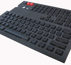
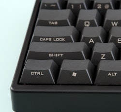
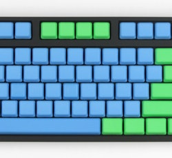
Side-printed keycap set
662
VOTES

PBT Cherry MX Side Print Keycap Set - Gold Print By Ducky

Vortex PBT Keycaps - Massdrop

Max Universal Cherry MX Translucent Clear Black Full Keyboard Set

Leopold black side printed keycap set, thick PBT
Nov 8, 2024

kuzigu
G20 Profile Keycaps
296
VOTES

G20 Blank Keycap Sets - Pimpmykeyboard.com

G20 1 Space (pack of 10) - Pimpmykeyboard.com

G20 Sublimated Sets - Pimpmykeyboard.com
Nov 17, 2024
hightower
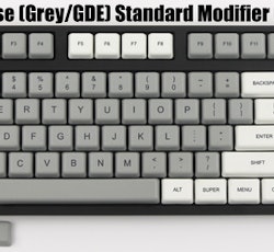
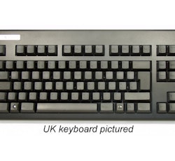
Topre Realforce ISO layout (SE, FI, NO, DK, EE)
358
VOTES

Swedish Topre Realforce 88UB 45g Key Black on Black Mini Keyboard (YA51B0)

Swedish/Finnish Topre Realforce 105UB 45g Light Gold on Black Keyboard (WE51B0)

UK Topre Realforce 88U 45g Black on Beige Tenkeyless Keyboard
Nov 22, 2024
jceaser
I don't want to live on this planet anymore!
3.8K
VOTES

Futurama

Star Wars

Elvish

Keycaps based on Yoda these are
Nov 10, 2024
Zenith22
Modernized Buckling Spring Keyboard Switch - Drop could bring it to life! (Not a
70
VOTES

Modernized Buckling Spring Keyboard Switch by Bogdan Chetraru — Kickstarter

No thanks.
Nov 8, 2024


Here's a picture illustrating what I'm talking about: