Click to view our Accessibility Statement or contact us with accessibility-related questions


Drop + Zambumon GMK Nautilus Nightmares Keycap Set
Drop + Zambumon GMK Nautilus Nightmares Keycap Set
bookmark_border
Where's the price?
To negotiate the best possible price for our customers, we agree to hide prices prior to logging in.
3.5K requests
·
613 Sold
·
Free Returns in USA
Product Description
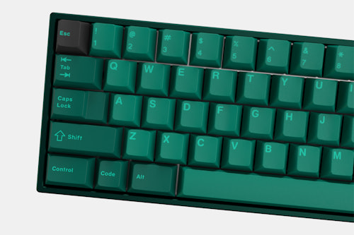
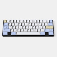
A follow-up to Zambumon’s smash-hit Nautilus keycap set, this dark green spinoff calls to mind the monstrous Cthulhu of the deep sea.

search
close
Sort by: Newest
keyboard_arrow_down
Muhappy
0
Feb 2, 2021
Hi guys I'm completely new to the Keyboard market, I was wondering will this keycap set come back for sale?
lifeonadklein
157
Nov 16, 2020
Hey Drop, please update the images on this page from renders to actual photos of the set. Now that extras are up, anyone who buys based on the photos currently up will be confusing and inaccurate and probably more returns for y'all to deal with.

noerms
16
Nov 18, 2020
orangekeebsYup, same thing again. Mail at midnight, checked at 6 am, everything gone ... come on @Drop
eliotkbunny
50
Sep 16, 2020
The more and more I look at render images and even the Google result images for the Nautilus Nightmares set the more frustrated I get with this kid. Man, how did they turn a dark, almost forest green into a dark cyan color?

cijanzen
600
Sep 10, 2020
Anyone have a screenshot of (I believe @Kevin ) pinned post that said we’d receive a $10 credit after the GB shipped? I emailed support and they said they don’t know what I’m talking about. The original pinned messages are gone now too.
(Edited)

cijanzen
600
Sep 10, 2020
That worked for me. Not that we should have to do this, but if anyone else is expecting a credit, you should probably email support and use this screenshot!
CarloNapolitano
43
Sep 10, 2020
you should contact drop customer support. They should be better able to manage the issue
MightyJabba
452
Sep 5, 2020
I spent some time trying to take some photos of the novelties while deciding whether or not to keep this set, and I'll have to say this color is super hard to photograph well. Whether I was using my DSLR or my phone, the novelties look almost entirely blue! The only way I was able to approximate what I see is to perform some color correction in photo editing software. I have uploaded before and after photos to the photos section here.
I'm definitely NOT saying that everybody is wrong and it actually looks just like the renders, but it's not as laughably off as some of the photos I've seen might suggest.
MightyJabba
452
Sep 3, 2020
I wanted to reserve judgment until my set arrived, but now that I have it in hand I can say that it's definitely more of a teal than I expected or wanted. I think it's still pretty attractive, but it's a different vibe than I had signed up for. I'm trying to decide whether or not to open my main set (so far I've just been looking at the novelties, which are visible without opening them).
CarloNapolitano
43
Sep 2, 2020
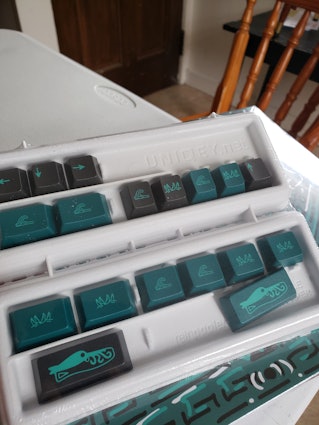
I have seen far too many comments of people both on instagram and here on drop saying this set ended up looking fine or could have been worse. "far too many" being like 8 in total which I find ludicrous that there is more than 0. The colors were wrong and can be clearly seen in pictures made by Zambumon and others who got their hands on the caps finally. I have them in hand now and from the look of the novelties that are packaged separately and visible, it is clearly blue and not the dark green promised in renders and in the descriptiom. Sure, some people might like the different colorway but the fact that I have to use different to describe them is a problem. Complacency with what we got should not be a valid response if this isn't the end result the majority of people expected/wanted. I will post a picture of what I can so others can see the REAL nightmare this set is and ask for a refund because I can't imagine how someone can be so colorblind and delude themselves into saying that "It's the lighting. The lighting probably changes it a lot". No, that isn't the case here.
Also, there is a difference between expecting an exact color palette, which is unreasonable in reality, versus what we have here.

jwordfish
67
Sep 6, 2020
i purchased during the extras sale and I feel like I would have appreciated seeing photos of the real keycaps on the page, for what it’s worth. Seems like it could be a good policy to swap in or add production sample photos once you have them.
CarloNapolitano
43
Sep 10, 2020
I agree that a color grabbing app is an inaccurate way to read color values using photos taken by other people on their phones but I find it incorrect to state you need special equipment to demonstrate the color of this plastic or else photos not taken with said equipment are invalidated.
Most photo sensors on phones today are a decent enough quality that you can get an idea of what color is actually being shown without the need of a research-grade optical sensor for color. Phone pictures are not the BEST solution but you dont need photography gear like a high-end dslr to show the color of something. You can still see that something is off in phone quality photos.
Showing 35 of 192
Recent Activity
.png?auto=format&fm=jpg&fit=fill&w=500&h=333&bg=f0f0f0&dpr=1&chromasub=444&q=70)
