Click to view our Accessibility Statement or contact us with accessibility-related questions


Showing 1 of 768 conversations about:

Makami
4255
Feb 16, 2018
bookmark_border
Vigrith
4081
Feb 16, 2018
bookmark_border
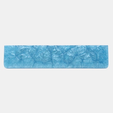
MakamiI believe they're both actual production units so the difference should be just in the lighting of the pictures; the bottom picture looks quite dark and very over saturated because as you can see 9009 is definitely not that dark, especially the pink/green. I'd say the top picture should be a bit more accurate with natural light.
Makami
4255
Feb 16, 2018
bookmark_border
VigrithThose had been my thoughts, too.
But i honestly like the bottom one more, being more copper, the upper one is to Rose (girly style, sorry ladies) for me :)
Decisions, Decisions.
Vigrith
4081
Feb 16, 2018
bookmark_border
MakamiCompletely fair - as a man I personally like the top one more still because it's closer to Apple's rose gold which I personally like very much; I think it'll be a bit easier to match keys to as well as it's a sauve colour and a more harmonious look with lighter sets (since you probably wouldn't be using darker ones even with the bottom shade right).
I think it's safe to assume the upper is what to expect however - especially if that green blank key shown with the beige set is the same (ish) colour as 9009 since that's exactly what they look like irl.
PS: also this https://www.instagram.com/p/Baf51xdhlF5/?taken-by=tokyo.keyboard
I think it's safe to assume the upper is what to expect however - especially if that green blank key shown with the beige set is the same (ish) colour as 9009 since that's exactly what they look like irl.
PS: also this https://www.instagram.com/p/Baf51xdhlF5/?taken-by=tokyo.keyboard
Makami
4255
Feb 16, 2018
bookmark_border
VigrithTy buddy, as always a pleasure to talk to you!
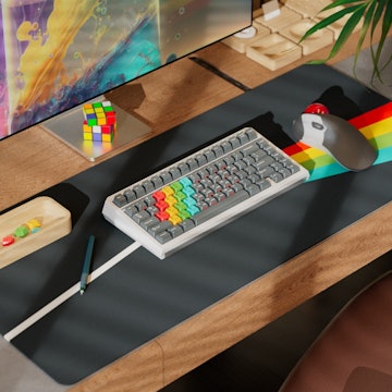
Would you mind to share your thoughts on this one: https://en.zfrontier.com/products/ganss-alt71?variant=3960238735371 the full package.
Would you mind to share your thoughts on this one: https://en.zfrontier.com/products/ganss-alt71?variant=3960238735371 the full package.
Vigrith
4081
Feb 16, 2018
bookmark_border
MakamiThat's a really cool concept - I think the price for the 75% + F row is a little steep since you're basically paying 50 bucks for F keys (and that cool logo I suppose too) but for F row + numpad it's actually pretty good since numpads of that quality are usually in the $75-100+ range. The caps look pretty cool too, not over the top or anything, plus cherry switches.
Overall I think the price is not bad, you're paying for the technology, R&D, etc for such a concept - other modular keyboards have been tried but this one seems to make a lot more sense from an engineering point of view. If it's something that interests you then I think it's a solid buy!
Overall I think the price is not bad, you're paying for the technology, R&D, etc for such a concept - other modular keyboards have been tried but this one seems to make a lot more sense from an engineering point of view. If it's something that interests you then I think it's a solid buy!
Related Products


Drop Refurbished
Like-new products you can trustDrop Rewards
Get $5 for every 500 points you earn! Learn more
Drop Keyboard Club
Become a member and expand your keycap collectionFollow Drop
I'm a bit confused, which picture/colors to trust, the one shown at description or https://imgur.com/a/NFOXl