Click to view our Accessibility Statement or contact us with accessibility-related questions


The Drop Progress Bar

search
close
Sort by: Newest
keyboard_arrow_downSharks
24
Nov 8, 2018
I would also like to request the status bar be returned as it provided a great resource to see what the best deal on a drop could be and how many people it took to get there at a glance. It was also helpful to see how many commits vs. outright buys there were to give a better idea on if the drop was going to be successful. I believe the issue with new user confusion could be solved with a simple quick & forced guided tour of how Massdrop works upon sign-up that explains the difference between a commit and “purchase/Join Drop” and how to read the bar. I know that would’ve been helpful when I first joined, but at the same time was also able to just figure it out by the short explanation you guys provided in the button for commit at the lowest price.
Thanks,
-Sharks
j-e-g
306
Sep 30, 2018
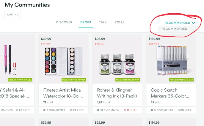
I have another question regarding the page changes. Does anyone else have problems with the drop down boxes. I am unable to change the option under the “RECOMMENDED” drop down selections. The drop down hides behind the information page. So he information is hidden and I am unable to change the order of the drops..... see image
j-e-g
306
Oct 7, 2018
Ummmm... nope. No new iPad for me.... I was fortunate enough to recieve my iPad and lap top as gifts last year. If either went belly up, I’d seriously have to debate replacing them out of my pocket..... that’s good pen money - 😂🤣😂🤣
midnightline
2
Sep 26, 2018
I also noticed that they've stopped doing price breaks with increased numbers of purchasers. It used to be once you got X number of people, the drop would lower in price by a few dollars... now it's just one flat price (which I've noticed has gone up for some drops that have been run before).
TiffanyPoodleslide
1403
Sep 11, 2018
Massdrop has, quite literally, LOWERED THE BAR.
It's catering to people who can't read their way through a drop carefully enough to grasp what The Bar is telling them.
I personally LOVE The Bar.
Maybe, in the interest of offering Productive Input,(instead of Mere Snark); How about you make it a Hide-able Feature. Like, a little on a button labeled, "Progress Bar", opens the Progress Bar on the page. You could have the default be HIDDEN Progress Bar, then those who like the Progress Bar could click the button and VOILA! Progress Bar Visible again! Is that possible? That would be way cooler than No Bar At All.
Maybe, in the interest of offering Productive Input,(instead of Mere Snark); How about you make it a Hide-able Feature. Like, a little on a button labeled, "Progress Bar", opens the Progress Bar on the page. You could have the default be HIDDEN Progress Bar, then those who like the Progress Bar could click the button and VOILA! Progress Bar Visible again! Is that possible? That would be way cooler than No Bar At All.
ChuckDee
1906
Aug 14, 2018
The Drop status bar was great, and I missed it when it was removed. Even understanding the changes and knowing what engendered them, I still don't find the other methods as they stand help as much as having the bar. It will be interesting to see what changes you come up with in order to get around the deficiencies we are currently experiencing, but there are definitely growing pains experienced in the meantime.
j-e-g
306
Aug 13, 2018
I miss the old status bar. I haven’t figured out the new status counter... Actually, I passed on some drops because I didn’t understand it. I think I purchased one that said what the price was and had no clue if there was or wasn’t a minimum that needed to be met. I appreciate your explanation, but yes, I miss the old one.
ltopper
1113
Aug 13, 2018
Theroc - completely hear you. The drop progress bar is a helpful tool for understanding the state of a drop at a quick glance. And I like that you're brainstorming because there are certainly other ways we can address this.
The intent of the simplification / removal is because new users have a difficult time understanding what the drop progress bar is and we've found that their retention and cognition improves when we remove some of the complexity required to understand our site.
The Drop Card's Purchased count will be updated soon to reflect that which appears on the Drop Page - that's also a great catch.
TiffanyPoodleslide
1403
Sep 11, 2018
ltopperI get it....
....but maybe they just need to take their Adderall before shopping.
I don't EVEN know how anybody manages Amazon or eBay within this logic set.
*sigh*
....but maybe they just need to take their Adderall before shopping.
I don't EVEN know how anybody manages Amazon or eBay within this logic set.
*sigh*

Trending Posts in Drop Hub

HoffmanMyster
Black Friday Bash 2024
It's that time of year again. We're cozying up for winter (at least here in the northern hemisphere); American Thanksgiving is right around the corner. And that means deals galore. We are kicking off our festivities a little early this year—Black Friday deals will run from November 21st through the 2nd of December. There's bound to be something here for everyone, so be sure to check them out! Black Friday Bash Details: ▪️ Bonus Rewards - Spend $250, get $20 in bonus rewards; spend $500, get $50; spend $750, get $100** (total spend throughout the event, does not need to be a single purchase) ▪️ Full list of deals here! ▪️ Giveaway - We will be hosting a giveaway this year—details coming soon ▪️ Main Bash landing page - Link to be added on Black Friday! Black Friday Coupon Breakdown: In addition to reduced prices, we've also cooked up some coupons for added savings this year! Nov 21st - 22nd ▪️ DCX20 - Save an extra $20 on any DCX Base Kit ▪️ DESKBTGO - Buy two desk mats...
Nov 20, 2024
ulianich
Order is canceled
The order is canceled after payment, I tried to pay with different cards (Lithuanian and Finnish), also with PayPal, but the result is the same, has anyone encountered this?
Nov 20, 2024
jenny56
Web Development in Dallas: A Beginners Guide
Are you living in Dallas and interested in web development? Maybe you want to learn how to code and make your own websites. Or perhaps you're a business owner who wants to build an online presence. Whatever your reason, getting into web development can be fun and fulfilling. This blog will help beginners in Dallas understand the basics of web development, including where to find learning materials, connect with local groups, and explore job options. Getting Started with Web Development 1. Learn the Basics Before you jump into the more complicated parts of web development, it's really important to understand the basics really well. That means getting familiar with three main things: HTML, CSS, and JavaScript. These are like the ABCs of web building. You can learn about them from lots of different places online, like websites that teach you step-by-step, or even interactive platforms where you can practice coding. 2. Choose Your Direction Web development isn't just one thing – it's...
Nov 18, 2024
mkben
Drop Keyboard Club Questions
Hello everyone! I'm looking to join DKC, but I have a few questions. The first day of November has already passed. Will I still get the coupon for November immediately after signing up today (Nov. 10)? What is the definition of Mechanical Keyboard products? Will the coupon apply to desk mats? I believe it should apply to everything listed under this category? For orders under $79, the coupon will be converted to a percentage discount. Will the percentage discount apply to all mechanical keyboard items in an entire order, or it can only be applied to a single mechanical keyboard item in the order? Thanks in advance!
Nov 11, 2024
ointment3d
Drop EDC?
saw some flashlights online. Does Deop have interest in jumping into EDC gear like pocket knives, pry, flash, etc? Thx
Oct 26, 2024
OK_Scout_Robert
Mass Drop Camping supplies
Does this community still Mass Drop Camping supplies?
Oct 23, 2024

jcoffin1981
Work around for firmware/configuration update error "command not recognized"
I spent more than an hour attempting to update my Drop Shift keyboard. I'm not sure what has changed, but I was not able to do it entirely from the Drop website as I had previously done. I have most of the keys configured how I would like, but the default LED function was a very bright, distracting, rainbow wave going across the keyboard. Every time I turned the computer on I had to manually adjust the lights how I liked. Using the online version or the locally installed app, you first have to install the QMK XAP interface. You then have to flash your already configured firmware file, which can be done on the Drop website. If you are logged in your last configuration is saved under your account and you can alter what you like, so you don't have to start from scratch. So, following the instructions I selected the appropriate board, entered bootloader mode, but when attempting to flash the file, I would get an error that the C:/Users/Mike C..... command is not recognized...
Oct 18, 2024
Drop Refurbished
Like-new products you can trustDrop Rewards
Get $5 for every 500 points you earn! Learn more
Drop Keyboard Club
Become a member and expand your keycap collectionFollow Drop
It is still there, and in case you haven't seen it for a while, it gives you a complete picture (literally) of the drop's status at a glance:
when the bar vanishes this becomes
for the same number.
It gets more confusing when you look at the card for the drop
When these changes first appeared it was a bit jarring, but I figured I'd get used them. It's been a while now and I still find it annoying.
I appreciate what the web designers at MD are doing and I have nothing but respect for them. Clearly the idea is to simplify and reduce clutter. However, in this case, less is less. The progress bar is a great at-a-glance info tool. You instantly know where things are at.
Also it's a Massdrop thing. Dont' hide it. I mean, what's wrong with this:
Anyway, this is my, clearly biased, opinion. What do you guys think?
Do you miss the status bar too?
Didn't even notice that it's gone?