Click to view our Accessibility Statement or contact us with accessibility-related questions.png?auto=format&fm=jpg&fit=fill&w=500&h=333&bg=f0f0f0&dpr=1&chromasub=444&q=70)
96% would recommend to a friend 


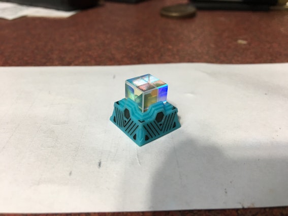
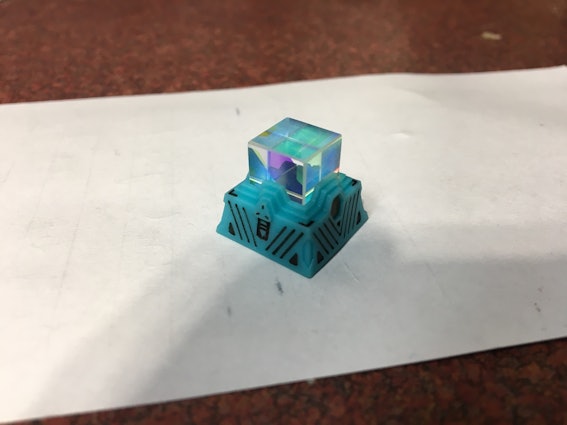


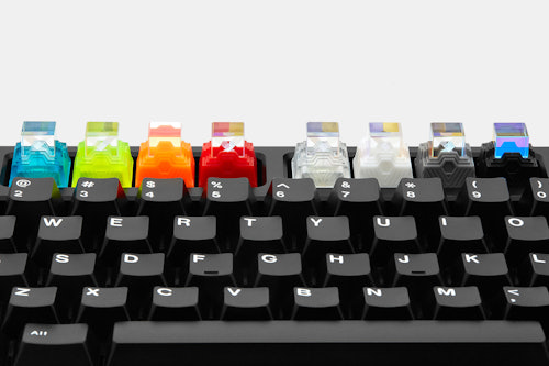
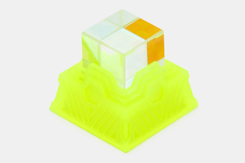
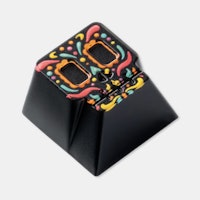
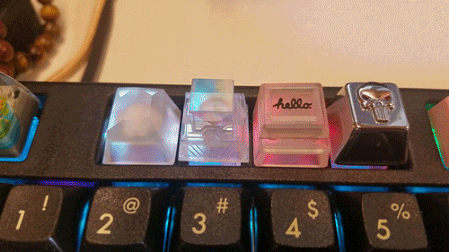
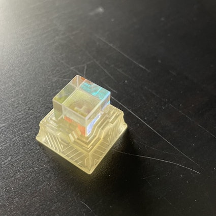
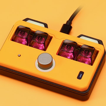
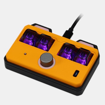
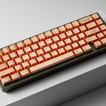
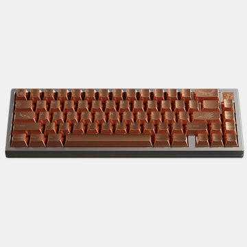
Gen.S Prism Resin Artisan Keycap
01 / 20
Gen.S Prism Resin Artisan Keycap
bookmark_border
Where's the price?
To negotiate the best possible price for our customers, we agree to hide prices prior to logging in.
3.2K requests
·
4.4k Sold
Product Description
From Gen.S, who brought you the Monitor Screen and Gem artisans, the Prism is like nothing before. Like a glowing obelisk or a monument to a higher power, this stunning keycap stands tall Read More
You Might Also Like
Customer Reviews
4.7
(372 reviews)
5star(294)
4star(54)
3star(16)
2star(4)
1star(4)
search
close
Images
keyboard_arrow_downSort by: Top Reviews
keyboard_arrow_downDuncan
3731
Nov 15, 2018
checkVerified Buyer
Like many others here, I got the completely transparent one, and it works really well with backlighting (as I'm sure the other ones do too). Even better when you set the backlighting to animate when you type. #PROTIP
tsqrd
15
Jul 10, 2019
checkVerified Buyer
Topaz + Pulse
Really happy with how well it matches my Pulse keycaps.

Recommends this product? Yes
Bronze-Knight
55
Nov 29, 2018
checkVerified Buyer

Jovian
41
Nov 30, 2018
checkVerified Buyer
Really recommend the transparent options. I bought Clear instead of Sapphire because I was worried the Sapphire wouldn't match with my Dasher keycaps' shade of blue. That decision turned out good, everyone comments on how pretty the keycap is!

Bengalkitty
29
Sep 23, 2018
checkVerified Buyer
Just doesn't stay on keycaps.
I bought the Opal option of this keycap, because I wanted the full effect of my RGB lighting to shine though. Overall, it's pretty and gem-like, and I love how it works with the rainbow effect on my CTRL keyboard. I also couldn't help but think that my Max Keyboard Falcon 8 would look sweet if I could justify buying 8 of these keycaps (and if I knew how to hack it for RGB). That said, there is room for improvement, if they release this again:
- The stem is a bit too small/tight or otherwise just slightly WRONG for my Cherry MX brown keycaps on my CTRL keyboard. It was a struggle to install, and I worry about the stem cracking or breaking [Update: It chipped the stem]. I see I'm not the only person with that issue, so perhaps they can adjust that. It's the reason I originally detracted one star, and now I can only give the keycap one star - what good is a keycap that damages switches and won't stay on them?
- The base part is too short for my tastes; it just exposes too much of the switch. It's even shorter than the base cap on my beloved fidget spinner keycap, which itself is shallower than the keycaps that came on my CTRL keyboard. I detracted a half star for that, but I suppose that is matter of personal preference. Still, a more standard cap size would have been better.
- Consider adding facets. The square shape and transparency of the "gem" make the stem extremely, unattractively obvious. Again, I bought the opal option with a translucent base, and I imagine this is not an issue in colors with solid bases. Adding some facets would help mask or distract from the stem. I knocked a half star for this, but again, others might not mind seeing the stem (or may not see it at all), so ymmv.
UPDATE 1: I was going to add back a star because I subtracted it due to things that can be considered a matter of taste. That said, I've had the keycap fall off because the stem doesn't fit well. Given the cap is rather hard to install, and then doesn't always stay put, I decided to leave things alone. I have this on my Pause/Break button, so it's not even a key I use. I don't regret my purchase, which is perhaps the most important thing.
UPDATE 2: Has continued to fall off the switch, and has always been tough to get seated properly again. Now, my switch has a small chip.
(Edited)
P1MPBOT5000
244
Sep 23, 2018
checkVerified Buyer
This is a pretty sweet keycap. For those that don't know, the prism is a dichroic glass cube. They are usually used in optics and beams. I assume they got ahold of a bunch of defective ones that are small. I have a large one. If you get ahold of one try taking photos through the cube you'll be surprised with the psychedelic results.
Big respect to Gen.S for this design.
Big respect to Gen.S for this design.
Laddikaura
4
Dec 23, 2021
checkVerified Buyer
Opal is not clear at all it’s yellowish
This is like a yellow pee color. 
Recommends this product? No
Tsumeb
9
Mar 2, 2021
checkVerified Buyer
Good for a solid 7 days
Stem cracked within a week. Looks nice while it lasted. Right now it's a useless lump of plastic. $25 worth.
Recommends this product? No

enero
604
Dec 8, 2020
checkVerified Buyer
Turns yellow
Just a heads up for anyone considering the clear variant (opal?).
In the two years that I've had this keycap, it has turned yellow from being in existence.
blackice6006
3
Nov 23, 2020
checkVerified Buyer
Great quality
Just a tad sharp on the edges, would not make a great esc key if you are prone to rage quits.
Recommends this product? Yes
Showing 13 of 396
Recent Activity


Related Products
Drop Refurbished
Like-new products you can trustDrop Rewards
Get $5 for every 500 points you earn! Learn more
Drop Keyboard Club
Become a member and expand your keycap collectionCollaborate With Us
For Brands & DesignersFollow Drop