Click to view our Accessibility Statement or contact us with accessibility-related questions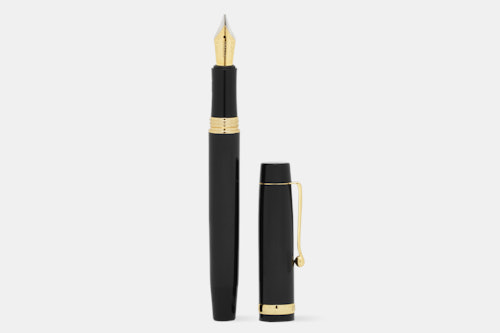
55% would recommend to a friend 


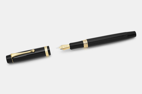
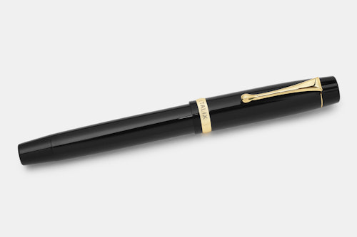
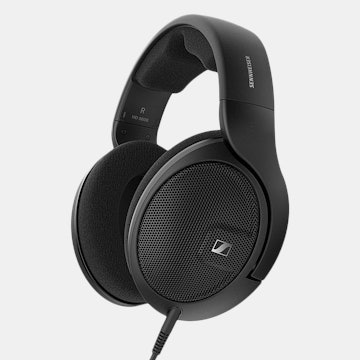
Italix Chaplain's Tankard Fountain Pen
01 / 08
Italix Chaplain's Tankard Fountain Pen
bookmark_border
Where's the price?
To negotiate the best possible price for our customers, we agree to hide prices prior to logging in.
166 requests
Product Description
From British pen maker Italix, the aptly named Chaplain’s Tankard fountain pen is made for easy filling. The convenient button fill mechanism means you’ll never have to take your pen apart to fill the converter inside Read More
Customer Reviews
3.8
(43 reviews)
5star(19)
4star(9)
3star(5)
2star(6)
1star(4)
search
close
Images
keyboard_arrow_downSort by: Top Reviews
keyboard_arrow_downplasticdaffofils
31
Feb 8, 2019
checkVerified Buyer
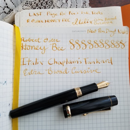
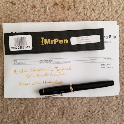
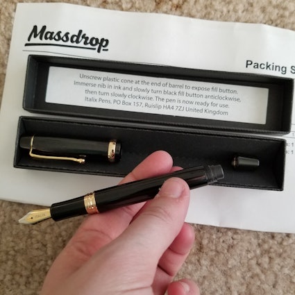
This pen certainly makes a wonderful first impression. I am already tempted to grab another.
Balance, weight, and finish are lovely. I don't have the exact words to describe it, but it feels wonderful in my hand.
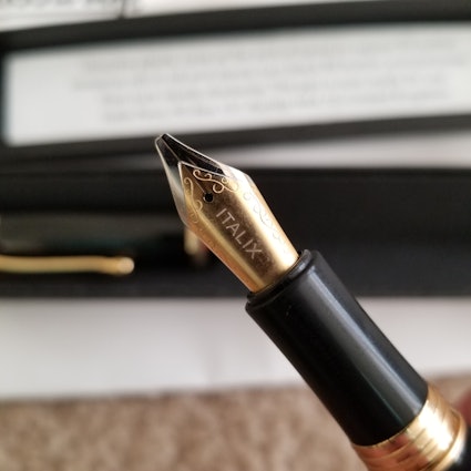
I went with Extra Broad Cursive for the nib. It performs as I had hoped and I'm very happy with it!
The cap takes some time to get on and off. Between this and the nib, I find it better for longer writing sessions or sketching vs office notes.
Photos below!
Ink: Robert Oster Honey Bee is generally too light for my tastes in a medium nib, the EBC makes it bearable but I've since changed to Ng Special 16, which I like much better.
Paper: Rhodia, Leuchtturm1917, Packing Slip (I was too excited about this)
Lighting: Shoddy 4pm Connecticut window light.

plasticdaffofils
31
Jul 9, 2019
plasticdaffofils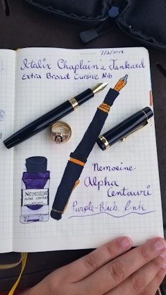
Theroc
2318
Keyboard Club Member
Dec 25, 2018
checkVerified Buyer
The Chaplain's Tankard is set to dethrone the Parson's Essential from Italix's line-up as their best-over-all pen.
The Parson's is a great pen, but the Tankard is even better value, is even better balanced, and it's section is even more comfortable to grip.
The only thing the Tankard lacks is the availability of several finishes.
Update:
The cap threading has been mentioned by others and I have to agree with what's been said. It is an issue.
The threading is, a better word escapes me, shallow; it's too easy for cross-threading to occur. At first it's fine, however, with each screwing-on of the cap the problem becomes more pronounced.
The Tankard is still my favorite Italix design so I won't drop my rating yet. However, I won't get another one until Italix improves execution.
(Edited)
writerstephen
480
Feb 15, 2019
checkVerified Buyer
I do like my Chaplain’s Tankard, very much, and I reach for it quite often. It’s a very comfortable, well-balanced pen, and it looks quite cool. It’s long when posted, but right in the sweet spot for me. The section is perfectly sized, and its brass construction gives it the perfect heft. I don’t use the “button fill” feature, but it doesn’t matter—it’s a good pen anyway.
now, the nib: I got mine with a left foot non-italic medium oblique, which I’ll explain in a minute. My next Italix I will just get with a regular medium nib—the oblique has been problematic for me.
I am a left handed side writer who holds the pen parallel to the lines on the paper and who tends to rotate the nib of my pen forward (toward the top of the page). I thought an oblique nib might be the ticket for me. I wasn’t wrong exactly, but the grind I got from Italix (the second one, actually, I got the same nib and same problem on a churchmans prescriptor, but I wanted to give them another chance) has some issues.
while it’s nice and smooth on the oblique cut, all other sections of the tip are either VERY scratchy or VERY sharp—like cut the paper sharp. You better write on the oblique only, or you ain’t writing. Now, I’m no nibmeister, but I’ve smoothed a nib or two, so I attempted to fix the problem myself. With the Chaplains, I was mostly successful—the whole tip is usable now. With the Churchmans, not so much. I’ve stil got a spot on the nib that’s needle-sharp. This is after at least half a dozen micro mesh sessions.
So, these pens are great values, well made with very good stock Jovo nibs—but watch out for the specialty grinds. It may be my unique writing characteristics that are the problem in my case, but for my part, I will just be getting a standard medium on my next Italix purchase.
(Edited)
TLHardy
26
May 18, 2019
writerstephenI saw a review on the oblique italic and the reviewer had the same issue. Writing smoothly at the right angle might just be a feature.
Boyce89976
43
Dec 23, 2018
checkVerified Buyer
It's been a long time since I've had a fountain pen. Past pens from Waterford and Pelikan were expensive and great in every way. This Italix , from the standpoint of writing experience, is the measure of any of them. Initially, the Italix wrote with a little scruff, and roughness, which is to be expected. I ordered the "Fine" nib, and after a few days has smoothed out and writes smoothly and flawlessly now (with Waterman Serenity Blue ink).
It look a few tries to get the reservoir completely full of ink, but once the nib was submerged deep enough, it was easy. The pen itself has a nice weight and balance, with the cap posted or not, and is very comfortable to write with. The fine nib writes with a slightly thicker stroke than I thought it would, which is good because I almost changed my order to the medium nib... glad I didn't. I will definitely grab another one of these when they drop again.
klr37
1
May 28, 2019
checkVerified Buyer
Very difficult to pick up and use...need to get positioning correct before writing or signing something that needs to be acceptable. An experiment for me so no more ITALIX for me.
wuwei128
2
Mar 28, 2019
checkVerified Buyer
great pen at a great price
jjreid2693aol.com
9
Feb 8, 2019
checkVerified Buyer
great pen! I worry what the odds are that the little cap covering the filling button will suddenly disappear like all those lost socks that have disappeared over the years. Till that happens I ‘ll continue to love this pen and the company that manufactured it.
Maliajwebb
9
Dec 23, 2018
checkVerified Buyer
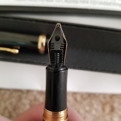
Disappointed. The italic nib....i.e. Stub nib, does not perform well. Skips, hard starts, rough downstroke which I mean is jagged along the top. Weight is ok as are proportions.
mrz3
1
Dec 23, 2018
checkVerified Buyer
find this pen a bit disappointing when screwing on the cap it appears that the threads are rough and bind..it is not a smooth feeling when attaching. pen itself just feels less well made. nib is ok but would not buy again nor order any more pens from this manufacturer...had great expectations :-( sorry
Gillum51
1
Dec 22, 2018
checkVerified Buyer
Overall a good pen. Nice weight and length. I have a broad cursive stub and it really adds character to your writing. I have had some skipping and hard starts on occasion but overall the pen behaves well. Good value for the price, as is the case with all Italix pens.
Showing 13 of 50
Recent Activity


Related Products
Drop Refurbished
Like-new products you can trustDrop Rewards
Get $5 for every 500 points you earn! Learn more
Drop Keyboard Club
Become a member and expand your keycap collectionCollaborate With Us
For Brands & DesignersFollow Drop