Click to view our Accessibility Statement or contact us with accessibility-related questions


Showing 1 of 473 conversations about:

astromaddie
36
Oct 10, 2014
bookmark_border
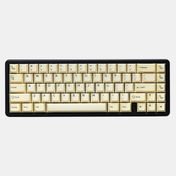
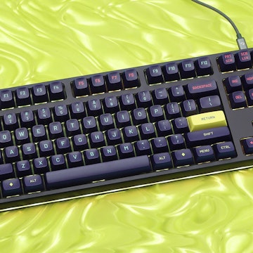
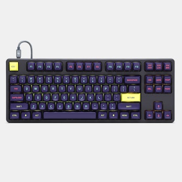
I was in for the mint set, but the Vermillo branding on the spacebar, the lack of Fn layer inscriptions, and Comic Sans legends pushed me away =( The colour looks gorgeous but I know all of that would really rub me the wrong way.

SillySpinner
162
Oct 10, 2014
bookmark_border
astromaddieI switched from mint to white on white. Having the Fn layer labeled is more important than having the primary layer labeled. I can touch type in the primary layer, but I'd be lost in the Fn layer.

astromaddie
36
Oct 10, 2014
bookmark_border
SillySpinnerI totally agree. I switched to grey on champagne largely for that reason.


