Click to view our Accessibility Statement or contact us with accessibility-related questions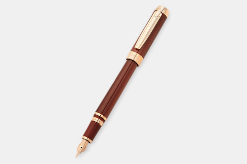


Chopard Classic Superfast Fountain Pen
01 / 09
Chopard Classic Superfast Fountain Pen
bookmark_border
Where's the price?
To negotiate the best possible price for our customers, we agree to hide prices prior to logging in.
122 requests
Product Description
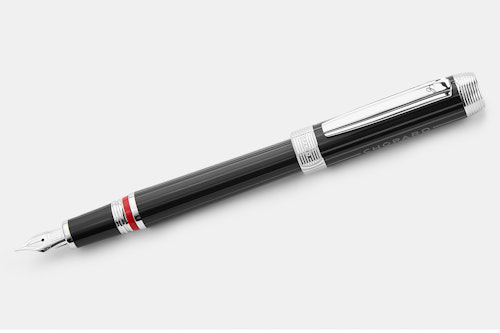
Made for the pen enthusiast who loves cars (or the other way around), the Chopard Classic Superfast is done in two colorways inspired by vintage automobiles. The resin body is complemented by gleaming trim and a rhodium-plated 18-karat-gold nib Read More
search
close
Sort by: Newest
keyboard_arrow_downjohnvh
28
Apr 10, 2019
Oh, come on! In the most recent drop for this pen MD claimed they had fixed the issue with the colors being reversed from what was ordered, but obviously not.
In the first drop I ordered a Brown/Rose Gold pen and received a Black/Palladium. I decided to keep it because it was also a nice pen.
In the most recent drop (which claimed to have fixed the issue) I again ordered a Brown/Rose and just received (surprise!) a Black/Palladium. So now I have two of the same pen and still don't have the one I really want.

lory_lin
0
Apr 4, 2019
Here one free recording pen,with 8GB memory and can be used as a normal pen ,if anyone interested in ,just contact with me and shipping it for you!
kaul
0
Mar 31, 2019
Not so great and price too much over inflated - http://www.fountainpennetwork.com/forum/topic/344858-chopard-superfast-fountain-pen
Please read the review before buying it !!
Marlowe7
25
Apr 1, 2019
kaulAside from the fact that MD screwed up the colours on the previous drop and I was initially annoyed, the pen is actually very nice indeed. I'm sure the reviewer's experience is as described but it sounds like a faulty pen rather than a fundamental flaw and I'm sure MD or Chopard would address. My experience of Chopard pens is excellent - very well made and very nice writers. I own 4 of their fountain pens and all are excellent, including this one. Lovely juicy nibs with just a hint of feedback.
DaveHoff
687
Mar 28, 2019
Hi All,
This drop has been correctly updated since the last run. Members will receive the correctly selected colors from now on.
Cheers,
Marlowe7
25
Feb 17, 2019
(Edited)

Xxxx168
0
Jan 31, 2019
TsuyoiNo reviews yet. This is the link from Chopard official website https://www.chopard.com/us/classic-superfast-fountain-pen-95013-0407
TomaCzar
755
Jan 27, 2019
So the Superfast Drop was fairly easy to pass up (although that red-on-black did speak to me). The Racer Drop a little less so, but somehow I managed. Congratulations MD, you've warn me down. It doesn't help that when I was researching the Superfast I came across this brown and rose gold Classic and was immediately smitten. None of the garrish branding of the Superfast or the silly automotive accents of the Racer. Clean lines and a classy pin stripe or gold-speckled finish. A worthy inaugural pen purchase for the new year.
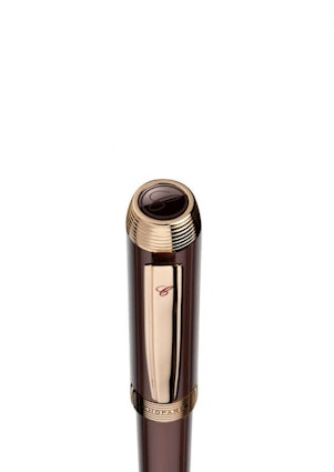
Since I disagree with MD's judgement that we don't need to see the finial, I've included a pic from the manufacturers website.
MrSharkbait
479
Jan 27, 2019
TomaCzarI agree this is the best looking of the bunch, but that CHOPARD branding on the side of the cap, though subdued, is still too much. There are 4 brand identifiers on the cap!
TomaCzar
755
Feb 9, 2019
MrSharkbaitJust received the pen today and there are actually 6 brand identifiers on the cap,. Two on the band, two on the cap, one on the clip, one on the finial and one at the end of the barrel. Seven (thunder/lightening) Seven brand identifiers AH AH AH AH AH!!!
All I can say is, maybe it's the influence of money already spent, but I really don't mind. I feel as though both pens are beautiful in their own right and the branding, while egregious on paper, is subtle enough to be unobtrusive within the pen being regarded as a whole.
Rocky_LaDoodle
6
Jan 27, 2019
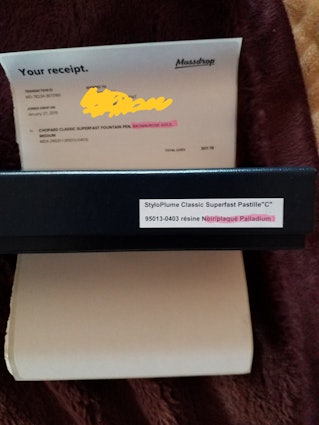
Is it just me, or are the images for the black/palladium and the brown/rose gold switched?
Kuantsai.Lee
17
Jan 27, 2019
Rocky_LaDoodleIt is not just you, the image and the descriptions do not match.
Kuantsai.Lee
17
Jan 26, 2019
Does the brown pen has the long grooves running along the barrel and the cap (as seen on the black pen)? Some photos suggest that it might, some not. Please help.
Kuantsai.Lee
17
Jan 27, 2019
Kuantsai.LeeTo answer my own question (since I have not heard from MD), I believe the long lines on the brown pen are just reflections. My guess is that the barrel and the cap on the brown are smooth as a mirror and, if so, would be incredibly pretty.
Showing 18 of 20
Recent Activity


Related Products


Drop Refurbished
Like-new products you can trustDrop Rewards
Get $5 for every 500 points you earn! Learn more
Drop Keyboard Club
Become a member and expand your keycap collectionCollaborate With Us
For Brands & DesignersFollow Drop