Click to view our Accessibility Statement or contact us with accessibility-related questions
.png?auto=format&fm=jpg&fit=crop&w=30&h=30&dpr=1&q=70)


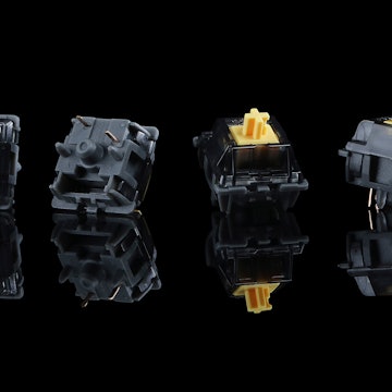
Kailh BOX Jellyfish Master Series Mechanical Switches
Kailh BOX Jellyfish Master Series Mechanical Switches
bookmark_border
Where's the price?
To negotiate the best possible price for our customers, we agree to hide prices prior to logging in.
47 requests
Product Description
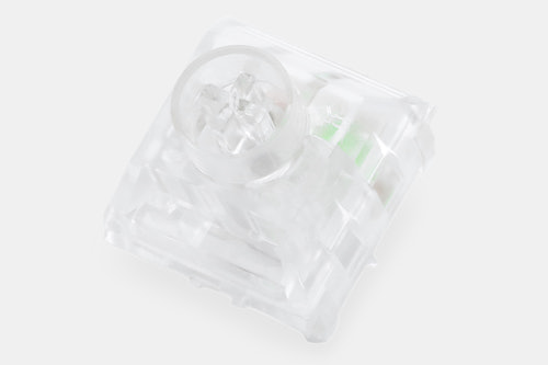
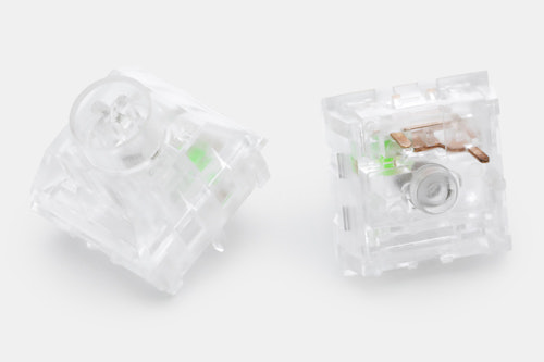
Leading the way in linear switch performance, the Kailh Jellyfish switch has many of the benefits of its namesake—with almost none of the drawbacks. Part of Kailh’s Box and Master Series, the Jellyfish features durable polycarbonate housings, a high-molecular polyamide stem, and a Master-Series-exclusive structure to improve service life Read More

search
close
Sort by: Newest
keyboard_arrow_down.png?auto=format&fm=jpg&fit=crop&w=30&h=30&dpr=1&q=70)
Arcy
40
Aug 4, 2021
Can't decide if these are cop or am I just better with gat milky yellows. Maybe even alpacas...
(Edited)

Fayne
2603
Jul 31, 2021
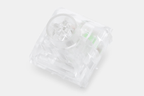
Oi, those horrible product photos.
Seriously, a white background?
Someone get Drop a photographer who knows how to take pictures of clear/transparent items, stat.

VALAISE
88
Dec 17, 2021
FayneAdjust your monitor gamut, or perhaps your viewing angle, if you can't see the details in the product photos clearly. Properly calibrated displays have no trouble with this imagery whatsoever.
...Maybe you could yoink the image and slap it into an image editor to tweak the curves? 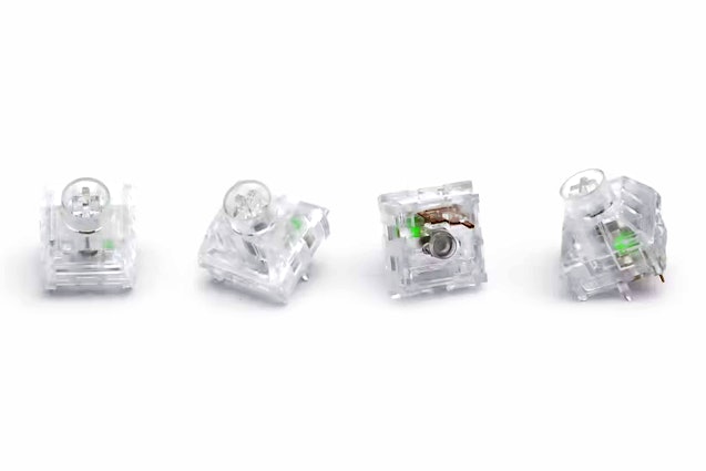


Fayne
2603
Dec 17, 2021
VALAISEJust to be clear, it is not my viewing angle. It is not my display calibration, brightness, contrast, or any of that crud. It looks like crap on every display I've checked, calibrated or not. The issue is the worst when using displays with HDR enabled, but still pretty bad on non.
If Drop had done some proper basic channel chop work, I wouldn't have a problem with the image. Without lighting and shadow tweaks it is incredibly difficult to see the details of a white translucent item on a white background. This is one of the only products on the site which has this particular image issue, and as you've stated, a simple 30-60 seconds of work in chop shop or gimp would solve the problem. Hell, even applying basic contour lighting in the stupid default iPhone photos app would solve the problem.
Soei
100
Jul 31, 2021
WHYYYYY!!!!
50grams (my personal sweet spot)
Low actuation
.
.
.
Lineair... *sigh*
Tactile version of these please. After Cherry Blacks and Speeds I've learned to detest lineair switches.
kgong5309
10
Apr 6, 2022
there's kailh speed coppers which are a tactile switch with a high actuation point
Rosko333
39
Jul 31, 2021
AndrewRobsI think every person on the planet who will ever want these will already have them by the time Drop says these will ship.
Recent Activity
