Click to view our Accessibility Statement or contact us with accessibility-related questions


Showing 1 of 516 conversations about:

ttran946
91
Jan 13, 2018
bookmark_border
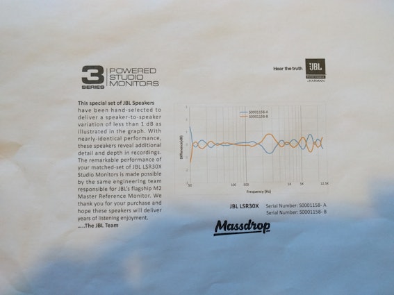
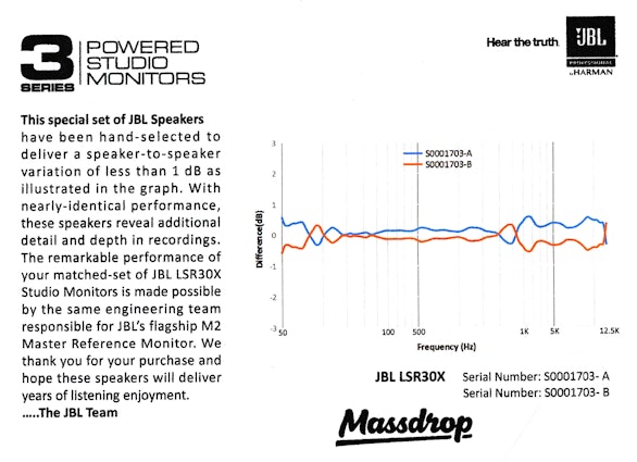
So first massdrop sends me a damaged pair and then the replacement pair they sent shows >1db difference at 50 hz (see picture). Does anyone think this really matters? I know it probably isn't a big deal, but it is the second time they delivered a pair to me in which I am not getting what I payed for :(
RojasTKD
375
Jan 13, 2018
bookmark_border
ttran946Honestly I'm not really sure how your suppose to read that graph, but seeing as they are basically mirror images perhaps that is how they are suppose to be read. If that is the case then these seem to be very well matched. Maybe someone with more knowledge can explain.
Either way, I seriously doubt you can notice the difference. I did a test once and I I don't think I could pick up a difference until 3dB and that was at a single tone and just noticeable. If a single frequency was off by 3dB in a song I doubt I would notice.
Personally at this price I think your getting a good deal. My advice unless there is an obvious problem, just listen and enjoy.
dsnyder0cnn
33
Jan 15, 2018
bookmark_border
ttran946The Y-axis is labeled "Difference (dB)". Difference from what? I've got a similar looking graph...with the orange and cyan lines identical in shape but mirror images of each other. This makes no sense to me. A graph that shows the difference in response between the two speakers would be a single line...not two. And if this was a frequency response plot of the two speakers, there would be two lines, but it would be virtually impossible for one to mirror the other. Does anyone know what this graph is actually supposed to illustrate?
ricekrispys
79
Jan 15, 2018
bookmark_border
dsnyder0cnnThere are words on the left of the paper, you know? That mixed with the chart labels should pretty much tell you what it is.
Raymondbl
54
Jan 15, 2018
bookmark_border
ttran946I wouldn't worry about the >1db difference at 50 hz. The purpose of frequency matching is to preserve imaging and stereo balance, but differences in stereo balance become very hard to hear as we get lower in the bass to the 50Hz-ish region anyway.
dsnyder0cnn
33
Jan 15, 2018
bookmark_border
ricekrispysThe text left of the graph is not helpful. It says, "...speaker-to-speaker variation of less than 1 dB as illustrated in the graph." How exactly does this graph illustrate speaker-to-speaker variation? I genuinely want to know.
Raymondbl
54
Jan 15, 2018
bookmark_border
dsnyder0cnnI agree, it's quite confusing. "Speaker-to-speaker variation" implies that one speaker is at most 1dB apart from its matched speaker, but the graph, at first glance, seems to imply that one speaker is at most 2dB apart from its matched speaker.
I personally interpreted it with the "other speaker" always being the 0dB line. So when we're looking at speaker A (the blue line), speaker B is implicitly the flat 0dB line. Whereas when we're looking at speaker B (the orange line), speaker A is implicitly the flat 0dB line. It's almost like two separate graphs overlaid on top of one another.
I personally interpreted it with the "other speaker" always being the 0dB line. So when we're looking at speaker A (the blue line), speaker B is implicitly the flat 0dB line. Whereas when we're looking at speaker B (the orange line), speaker A is implicitly the flat 0dB line. It's almost like two separate graphs overlaid on top of one another.
ricekrispys
79
Jan 15, 2018
bookmark_border
dsnyder0cnnBasically they are just saying the speakers are close to identical, within 1dB difference from each other. If you were to buy the a pair of the original JBL LSR305s, they only guarantee that they will be within a 5dB difference from each other.
dsnyder0cnn
33
Jan 15, 2018
bookmark_border
RaymondblI believe I've cracked the code! The cyan line is the output of speaker A minus the output of speaker B, and the orange line is B - A. If I'm right, this is a needlessly complicated way to illustrate the difference; the cyan line alone would suffice. Also, the legend is incorrect. It should say "A - B" for one line and "B - A" for the other. Perhaps they thought that this math would confuse people? Still, if the goal was to not be confusing, they should have stuck to just one line on the graph.
Regardless, the LSR30X really are a yummy sounding pair of powered monitors, especially when setup properly. Yes, there's a slight amount of "white noise" that I can hear up to a meter or two away when nothing is playing. In my case, the amount of hiss is the same for all settings of the input trim except for "0" (all of the way down) where it goes away completely with a faint "tick". They benefit from a little room gain, so placing them one to two feet from the rear or side walls and having your head < 3ft from the wall behind you will help to fill out the bass. The highs are not harsh or fatiguing. Off axis response sounds like it is well behaved (as you'd expect from JBL).
Many thanks to Massdrop for setting up this drop and then offering us such a great price. Even at the original price, the LSR30X offer excellent value for money, but I'm glad I caught them at this price and didn't have to wait too long for them to arrive. Cheers and happy listening!
dsnyder0cnn
33
Jan 15, 2018
bookmark_border
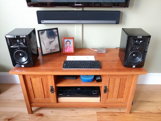
dsnyder0cnnNot their permanent location or an ideal setup in any way, but even placed here, they have great tone. In this picture, I'm driving them from a Raspberry Pi 3 Model B with a HiFiBerry DAC+ Pro HAT. The RPi is running the DietPi distro with Roon Bridge for streaming software. The combination supports PCM network streams up to 24-bit, 192kHz and advanced DSP, including parametric EQ and convolution for digital room correction. It's a seriously sophisticated playback system for its tiny cost!
dsnyder0cnn
33
Jan 15, 2018
bookmark_border
ricekrispysThanks, but I think we all knew what they were trying to say. The graph, as labeled, just doesn't make much sense. I think I've sorted it. See my other post.
bdleslie
19
Jan 26, 2018
bookmark_border
ttran946(whoops, dsnyder got it before I did, but for anyone still confused, my duplicative explanation may help) That graph is bizarre -- there is no way that one speaker would perfectly mirror the frequency response variations of the other across the entire spectrum. It looks to me like EITHER the orange or the blue is the difference signal (if you arbitrarily consider one of the speakers to be totally flat), and then they just inverted it and printed the same difference signal again. If we can agree to look at just the orange line as the difference in frequency response, then it's meeting 1 dB tolerance.
I agree that something was lost in the semantics, but that's the only way that graph makes sense. They printed the difference signal as compared to the other speaker twice (making speaker A and then speaker B arbitrarily completely flat) rather than once. Probably an assembly line guy assigned the fun task of running the graph, not a speaker engineer.
I agree that something was lost in the semantics, but that's the only way that graph makes sense. They printed the difference signal as compared to the other speaker twice (making speaker A and then speaker B arbitrarily completely flat) rather than once. Probably an assembly line guy assigned the fun task of running the graph, not a speaker engineer.
ttran946
91
Jan 26, 2018
bookmark_border
bdleslieI agree, this is the most confusion display ever. I am an engineer (not audio), if I presented data is such a terribly confusing way I would be fired haha. They should have just displayed one line and there would be no questions. I think the above comments make sense. It is definitely two graphical representations of the same thing by subtracting one from the other and then reverse.
Related Products


Drop Refurbished
Like-new products you can trustDrop Rewards
Get $5 for every 500 points you earn! Learn more
Drop Keyboard Club
Become a member and expand your keycap collectionCollaborate With Us
For Brands & DesignersFollow Drop